Classic Cities Jakarta [Quenched]
Moderator: Cartographers
Re: Classic Cities Jakarta [30/10]V4,P2
Version 4.
Sorted the text and background, glows, buildings, territ lines and rivers.
Sorted the text and background, glows, buildings, territ lines and rivers.

-

 koontz1973
- Posts: 6960
- Joined: Thu Jan 01, 2009 10:57 am


Re: Classic Cities Jakarta [30/10]V4,P2
Ok, the background is good enough for now (although I'd suggest making the right side the same colour as the left... the current right side looks too much like some of the territory colours). The legend font... well, it's not one I'd personally choose, but good enough.
The territory labels... I think you could make them larger. You have more than enough space for it. Also... which font is that? It looks like some letters are smaller than others... do you have auto-hinting on in the text settings?
The territory labels... I think you could make them larger. You have more than enough space for it. Also... which font is that? It looks like some letters are smaller than others... do you have auto-hinting on in the text settings?

-

 natty dread
- Posts: 12877
- Joined: Fri Feb 08, 2008 8:58 pm
- Location: just plain fucked


Re: Classic Cities Jakarta [30/10]V4,P2
natty_dread wrote:Ok, the background is good enough for now (although I'd suggest making the right side the same colour as the left... the current right side looks too much like some of the territory colours). The legend font... well, it's not one I'd personally choose, but good enough.
The territory labels... I think you could make them larger. You have more than enough space for it. Also... which font is that? It looks like some letters are smaller than others... do you have auto-hinting on in the text settings?
This is the font, one of the ones you chose.
http://www.dafont.com/alte-haas-grotesk.font
Will change the background colour.
Legend font is nice, I like it. Different at least and no one can say it is a windows doc.
Text size, if I go up one, some move over territ lines. Do not mind the redraw but would rather keep it as close as it is now for a proper representation of the city. The e is smaller for some reason. Colour of the legend, I want it to stand out but can easily change it.

-

 koontz1973
- Posts: 6960
- Joined: Thu Jan 01, 2009 10:57 am


Re: Classic Cities Jakarta [31/10]V5,P2
Ok, the text looks much better now.
Now... there are a few places where the borders are a bit ambiguous. Jagakarsa - Cilandak: the border is so small it's easy to miss, same but opposite on Pesanggrahan - Cilandak: the territory in between, Lama, is so narrow near the land edge that it could cause confusion... I suggest making those a bit clearer.
Now... there are a few places where the borders are a bit ambiguous. Jagakarsa - Cilandak: the border is so small it's easy to miss, same but opposite on Pesanggrahan - Cilandak: the territory in between, Lama, is so narrow near the land edge that it could cause confusion... I suggest making those a bit clearer.

-

 natty dread
- Posts: 12877
- Joined: Fri Feb 08, 2008 8:58 pm
- Location: just plain fucked


Re: Classic Cities Jakarta [31/10]V5,P2
natty_dread wrote:Ok, the text looks much better now.
Now... there are a few places where the borders are a bit ambiguous. Jagakarsa - Cilandak: the border is so small it's easy to miss, same but opposite on Pesanggrahan - Cilandak: the territory in between, Lama, is so narrow near the land edge that it could cause confusion... I suggest making those a bit clearer.
Like this then.

-

 koontz1973
- Posts: 6960
- Joined: Thu Jan 01, 2009 10:57 am


Re: Classic Cities Jakarta [31/10]Page 1 & 3
I think this is over due for a sticky
-

 The Bison King
- Posts: 1957
- Joined: Thu Aug 27, 2009 5:06 pm
- Location: the Mid-Westeros


Re: Classic Cities Jakarta [31/10]Page 1 & 3
Thanks TBK, was starting to get that sinking feeling. Made my day this has. 
That just goes to show how bad today has been.
That just goes to show how bad today has been.

-

 koontz1973
- Posts: 6960
- Joined: Thu Jan 01, 2009 10:57 am


Re: Classic Cities Jakarta [31/10]Page 1 & 3
OK, as we move out of the drafting room into the main part of the foundry, I would like to try and leave graphics alone and concentrate on gameplay. As this is a classic city, I would rather not provide a mediocre map that will get played once or twice and then forgotten. So, everything is open to debate from bonus zones, values, impassables, neutral values. Open or closed style. Everything. The only thing that will be closed to debate is the territ lines. As this is the city as is so moving them, you remove the city. I tweaked them for natty as he made the point of clarity but the gameplay was not compromised.
After that, we can get onto graphics but please leave any ideas you have.
Lets have your ideas then. This is your map.
After that, we can get onto graphics but please leave any ideas you have.
Lets have your ideas then. This is your map.

-

 koontz1973
- Posts: 6960
- Joined: Thu Jan 01, 2009 10:57 am


Re: Classic Cities Jakarta [31/10]Page 1 & 3
I know you want to focus more on tackling gp atm, but I think a minimap might hep clarify the legend because, imo your colors don't match.
And do they really not use bridges in Jakarta? because so many ferries seems ineffcient and the mp might benefit graphically from some bridges.
So the gp looks pretty good to me and I guess I just have graphics comments for future consideration. Though really I'd recommend making small graphic changes as you go along, even if you're focusing on gp atm.
Sketchblog [Update 07/25/11]: http://indyhelixsketch.blogspot.com/
Living in Japan [Update 07/17/11]: http://mirrorcountryih.blogspot.com/
Russian Revolution map for ConquerClub [07/20/11]: viewtopic.php?f=241&t=116575
Living in Japan [Update 07/17/11]: http://mirrorcountryih.blogspot.com/
Russian Revolution map for ConquerClub [07/20/11]: viewtopic.php?f=241&t=116575
-

 Industrial Helix
- Posts: 3462
- Joined: Mon Jul 14, 2008 6:49 pm
- Location: Ohio


Re: Classic Cities Jakarta [31/10]Page 1 & 3
Bridges can go in, no problem and a mini map is always a good idea. Will add them to the list of things to do.
Jakarta had a river ferry service that had to close down because of the rubbish in the rivers. When I read that, it seemed different than having bridges, but why not have bridges.
Jakarta had a river ferry service that had to close down because of the rubbish in the rivers. When I read that, it seemed different than having bridges, but why not have bridges.

-

 koontz1973
- Posts: 6960
- Joined: Thu Jan 01, 2009 10:57 am


Re: Classic Cities Jakarta [31/10]Page 1 & 3
Added the mini map and bridges. Starting to work on the river.
Reduced the Airport neutral to 3 so it comes into play earlier.
Version 4.
Reduced the Airport neutral to 3 so it comes into play earlier.
Version 4.

-

 koontz1973
- Posts: 6960
- Joined: Thu Jan 01, 2009 10:57 am


Re: Classic Cities Jakarta [9/11] Version 4. Page 1 & 3
unfortunately, you still gotta name your bonus regions, but the minimap looks great imo... i think you can squeeze some names on there. The bridges are a little weak imo. you might try some freeway style bridges or even some wooden ones.
Sketchblog [Update 07/25/11]: http://indyhelixsketch.blogspot.com/
Living in Japan [Update 07/17/11]: http://mirrorcountryih.blogspot.com/
Russian Revolution map for ConquerClub [07/20/11]: viewtopic.php?f=241&t=116575
Living in Japan [Update 07/17/11]: http://mirrorcountryih.blogspot.com/
Russian Revolution map for ConquerClub [07/20/11]: viewtopic.php?f=241&t=116575
-

 Industrial Helix
- Posts: 3462
- Joined: Mon Jul 14, 2008 6:49 pm
- Location: Ohio


Re: Classic Cities Jakarta [9/11] Version 5. Page 1 & 3
Version 5
Mini map names and new bridges. THe top two need to be scaled down some but need opinions on if these work first?
Mini map names and new bridges. THe top two need to be scaled down some but need opinions on if these work first?

-

 koontz1973
- Posts: 6960
- Joined: Thu Jan 01, 2009 10:57 am


Re: Classic Cities Jakarta [9/11] Version 5. Page 1 & 3
And now I would say that this is over due for a stamps so...


-

 The Bison King
- Posts: 1957
- Joined: Thu Aug 27, 2009 5:06 pm
- Location: the Mid-Westeros


Re: Classic Cities Jakarta [9/11] Version 5. Page 1 & 3
Koontz asked me, what types of buildings fit every region.
(Note : I don't mind if you put rumah gadang on the map. Because that is the traditional building from Padang, Sumatra, where I come from. But other Indonesian will be angry, lol)
* Jakarta Barat (West Jakarta)
There is a big Landmark in this region : Taman Anggrek. This is a picture I found trough googling :
In this region there are many good Universities, one of them is Bina Nusantara, a good university for IT.
* Jakarata Selatan (South Jakarta)
Jakarta Selatan is the Shopping Paradise in Indonesia. These are 3 of them :

Blok M Mall

Cilandak Town Square
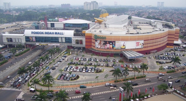
Pondoh Indah Mall
* Jakarta Pusat (centre Jakarta)
Only 1 building match this region : The Landmark of Jakarta
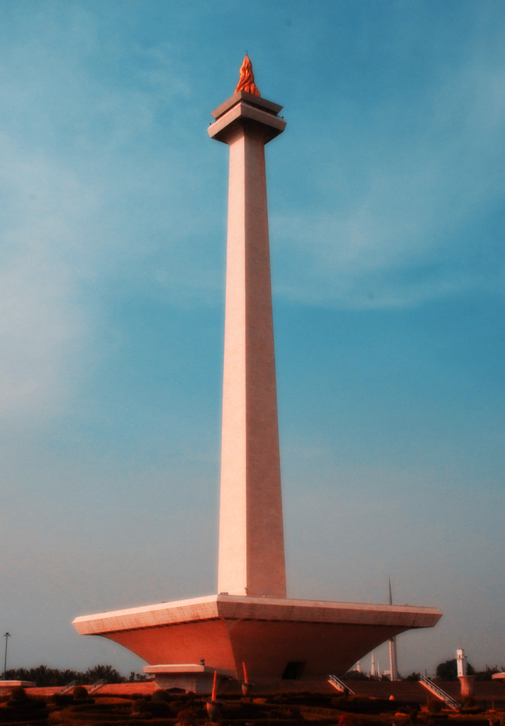
Monumen Nasional
* Jakarta Utara (North Jakarta)
Koontz already knows this is an Industrial Region. I have no idea what is the best building here.
* Jakarta Timur (East Jakarta)
The best place to visit here is Taman Mini Indonesia. And the location fit in the existing Legend on the Map.
Hope this helps
(Note : I don't mind if you put rumah gadang on the map. Because that is the traditional building from Padang, Sumatra, where I come from. But other Indonesian will be angry, lol)
* Jakarta Barat (West Jakarta)
There is a big Landmark in this region : Taman Anggrek. This is a picture I found trough googling :

In this region there are many good Universities, one of them is Bina Nusantara, a good university for IT.
* Jakarata Selatan (South Jakarta)
Jakarta Selatan is the Shopping Paradise in Indonesia. These are 3 of them :

Blok M Mall

Cilandak Town Square

Pondoh Indah Mall
* Jakarta Pusat (centre Jakarta)
Only 1 building match this region : The Landmark of Jakarta

Monumen Nasional
* Jakarta Utara (North Jakarta)
Koontz already knows this is an Industrial Region. I have no idea what is the best building here.
* Jakarta Timur (East Jakarta)
The best place to visit here is Taman Mini Indonesia. And the location fit in the existing Legend on the Map.
Hope this helps
-
 Geger
Geger
- Posts: 325
- Joined: Tue Sep 16, 2008 11:29 am
- Location: Sumatra


Re: Classic Cities Jakarta [9/11] Version 5. Page 1 & 3
Thanks a lot Geger. Hope to do some of those justice.

-

 koontz1973
- Posts: 6960
- Joined: Thu Jan 01, 2009 10:57 am


Re: Classic Cities Jakarta [4/12] V5 Page 1 & 3
Latest image.
Been a while,about time I got round to this one.
Are there any GP features that need to be addressed or is there anything else that someone would like to be put in?
Been a while,about time I got round to this one.
Are there any GP features that need to be addressed or is there anything else that someone would like to be put in?

-

 koontz1973
- Posts: 6960
- Joined: Thu Jan 01, 2009 10:57 am


Re: Classic Cities Jakarta [4/12] V5 Page 1 & 3
Sorry for the delay, I will take a look again at this this evening.
-
 isaiah40
- Posts: 3990
- Joined: Mon Aug 27, 2007 7:14 pm


Re: Classic Cities Jakarta [4/12] V5 Page 1 & 3
At a close look, I thought "How does Andy have any game play value on the map?" Then it was like, oh the monkey is just for decoration! 
Anyhow, I think that Pusat probably is a tad undervalued, considering that it is in the center of the map for all intensive purposes. Plus all but one territory borders another bonus. It could probably be increased to +7, maybe +8.
Where you have "Darker territories ..." Reword it to read " Like a true Classic City, Jakarta has many expats living there - darker territories - These ..." I think this makes it a little more clearer as to where the expats are. I'll get the other CA's to take a look at this, and maybe we can get this stamped soon!
-
 isaiah40
- Posts: 3990
- Joined: Mon Aug 27, 2007 7:14 pm


Re: Classic Cities Jakarta [4/12] V5 Page 1 & 3
isaiah40 wrote:At a close look, I thought "How does Andy have any game play value on the map?" Then it was like, oh the monkey is just for decoration!
Anyhow, I think that Pusat probably is a tad undervalued, considering that it is in the center of the map for all intensive purposes. Plus all but one territory borders another bonus. It could probably be increased to +7, maybe +8.
Where you have "Darker territories ..." Reword it to read " Like a true Classic City, Jakarta has many expats living there - darker territories - These ..." I think this makes it a little more clearer as to where the expats are. I'll get the other CA's to take a look at this, and maybe we can get this stamped soon!
As isaiah said, Pusat would do much better as a +8. Also, I believe Timur should be upped to +5, as it's not much different from Selatan, which is of equal value.
-Sully
Beckytheblondie: "Don't give us the dispatch, give us a mustache ride."
Scaling back on my CC involvement...
Scaling back on my CC involvement...
-

 Victor Sullivan
- Posts: 6010
- Joined: Mon Feb 08, 2010 8:17 pm
- Location: Columbus, OH


Re: Classic Cities Jakarta [4/12] V5 Page 1 & 3
I'm trying to hard to like this map, but just something about the mish-mash of styles and colors must be out of my taste, so I'm afraid I can't be of much help in the development.
Best of luck,
--Andy
Best of luck,
--Andy
-

 AndyDufresne
- Posts: 24935
- Joined: Fri Mar 03, 2006 8:22 pm
- Location: A Banana Palm in Zihuatanejo


Re: Classic Cities Jakarta [4/12] V5 Page 1 & 3
Per map makers request, this map has been put on vacation.
[MOVED]
[MOVED]
-
 isaiah40
- Posts: 3990
- Joined: Mon Aug 27, 2007 7:14 pm


Re: [VACATION valid until June 2012] Jakarta [15/1] New styl
After all the comments about the style not having a focus, I got to play around a bit and remembering a painting my father has, tried to emulate that. If it does not work, then back it can go till I find more of a focus.
Title needs to be worked over to bring it into line with the rest of the image but thought I would see if the community liked this approach.
Title needs to be worked over to bring it into line with the rest of the image but thought I would see if the community liked this approach.

-

 koontz1973
- Posts: 6960
- Joined: Thu Jan 01, 2009 10:57 am


Who is online
Users browsing this forum: No registered users


