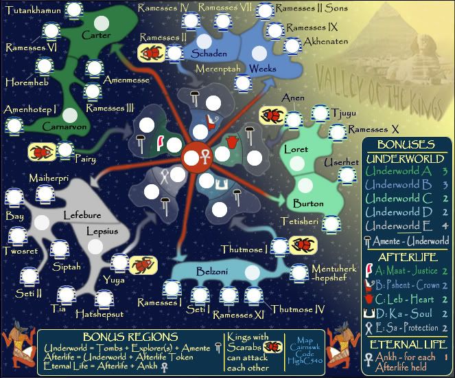
Enigma wrote:wow cairns- this is beautiful. the colours are gorgeous, the pathways are so much clearer, and the touch of continent colour in the underworld is absolutely brilliant. (im not sure whos idea that was, but im not really interested in going back and reading 2 months worth of posts).
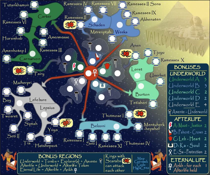
as for comments, i have to agree with keygoi about the font being a bit pixely- especially in the legend, but also throughout the map and in your (and highc540's) sig.
2nd, there is a dark line dividing each amente from its paired afterlife. these lines look like they could almost make a circle if connected, but it seems that they would not quite match up. i think the map would look better if these lines were based around a perfect circle as this is the focal point of the map. [also note that on maat this line does not connect all the way to the upper edge of the "cloud"].
other than that i cant see any tweaks.
Enigma...thanks for the comments.
* I've attended to those circular line...these should be far better now.
* I've adjusted all the headings in the legend....there is still some small pixelation happening there from the font type, but I think this is much better than it was.
Small @100
http://i155.photobucket.com/albums/s282 ... 0S-100.jpg
Large @ 100
http://i155.photobucket.com/albums/s282 ... 0L-100.jpg
XML with territories
http://putstuff.putfile.com/97827/5626457