- Click image to enlarge.

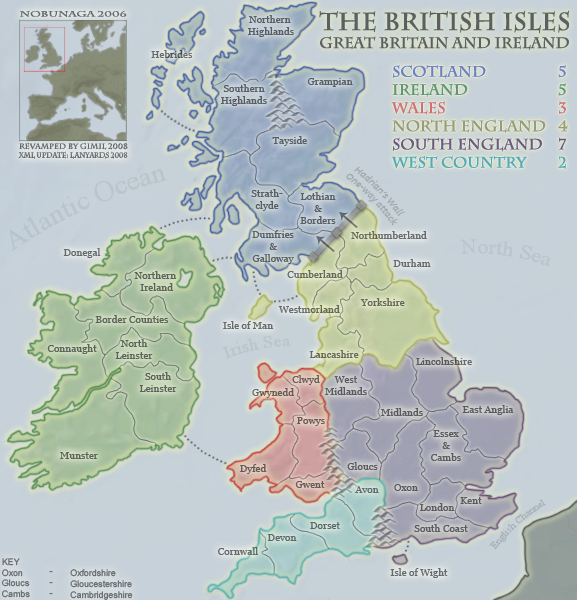
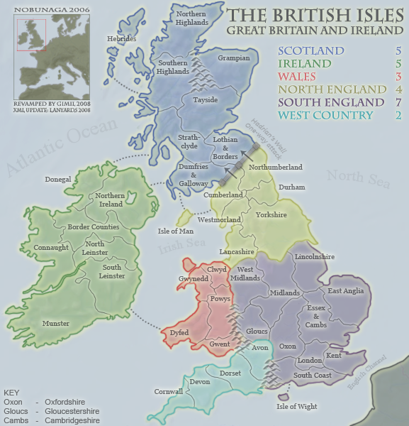
I think your borders are too bright compared to the rest of the map. As I've said, this feels washed out. I don't personally like the dullness of it, but you're in the forge, so be it. The colored borders though, are a bit bright. Have you tried black (or gray)?
COuld you also maybe tone down the borders/background where the territ text is over top of it? - Like mainly up in Hebrides is the only problem area i see.
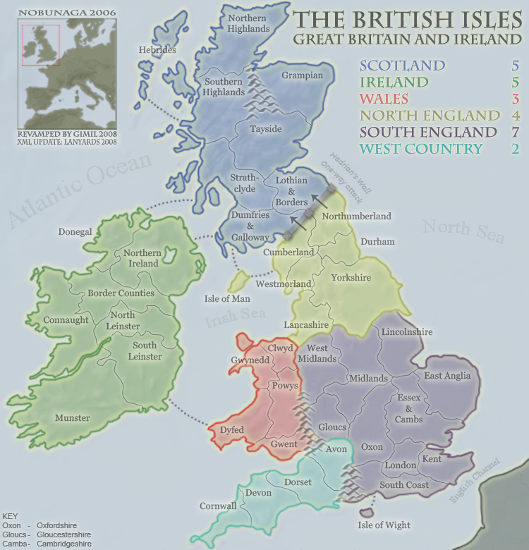
You know what would be cool - is if you would add some relief to the map, like a
bump map. See the mini-map up in the left - how there is some darker terrain areas? That would be cool on the large map as well. I can kind of see a little swirly pattern on the land areas, but not really.
Yes - the bold bright borders need something done. Now my eyes are drawn to them.


