
Sorry, I've kept the updates to the first post til this point and noone complained... I'll paste it in the end as well from now on.
LARGE map
[bigimg]http://www.cwebproduction.com/stuff/nordics-large-rev17.jpg[/bigimg]
SMALL map
[bigimg]http://www.cwebproduction.com/stuff/nordics-small-rev17.jpg[/bigimg]
[Abandoned] - Scandinavia
Moderator: Cartographers
Forum rules
Please read the Community Guidelines before posting.
Please read the Community Guidelines before posting.
Re: Scandinavia - Rev 17 - July 2010
I don't need a 500px image in my signature because I don't have anything to compensate for.
-
natty dread

- Posts: 12877
- Joined: Fri Feb 08, 2008 8:58 pm
- Location: just plain fucked
Re: Scandinavia - Rev 17 - July 2010
The subdivisions of Sweden are too hard to tell apart. I suggest making south sweden lighter and north sweden darker.


Re: Scandinavia - Rev 17 - July 2010
i'm sorry to say this, but with natty's Nordic Countries map now, is there a point to working on this? They're pretty much identical maps. I know you've put in like 3 years on this but, I'm just wondering.
High Score: 2906
-
RedBaron0

- Posts: 2657
- Joined: Sun Aug 19, 2007 12:59 pm
- Gender: Male
- Location: Pennsylvania
- Contact:
Re: Scandinavia - Rev 17 - July 2010
It's a unique map it just needs some sprucing up, the colors are never going to pass the color blind test. A minimap might be helpful here instead of the listing legend. The forests need to be.... forests, not black holes. The reindeer seem really out of place and pasted on. Which bonus is Aland in? The north arrow seems totally unnecessary. I think the ocean can use a little bit of texture, it's just flat.


Re: Scandinavia - Rev 17 - July 2010
Thanks for the feedback.
> is there a point to working on this?
Yes, I think there is. If nothing else, to avoid doing the previous work for nothing. But as Redbaron pointed out, there is also other reasons. Both gameplay and visual style is quite different from the nordic countries map. There are many other regions which have multiple (but different) maps, around 10 USA maps for example.
> the colors are never going to pass the color blind test.
Actually, I've already confirmed that the colors work. It doesn't look good for the color blind but it's easy to see difference between the areas. With some further tweaking like nattys suggestion it should be fine.
> A minimap might be helpful here instead of the listing legend.
Yeah... i've been thinking about a mini map for a while now but I'm afraid it might also make it less clear in some ways. Plus, i kind of like the list... I think I will do two versions next, one with minimap and one with the list.
> The forests need to be.... forests, not black holes.
It's really difficult to make a good looking forest when you're using a photographic style. If i would make cartoon looking trees like most maps it would make an ugly contrast to the moutain range and the lakes. It's not supposed to be black holes though, they are supposed to be more green and look like a forest actually look from a satellite.
> The reindeer seem really out of place and pasted on.
That's because it IS pasted on It may need some polish but I think a raindeer is a good choice as an icon for Laponia. The same argument can be made about the ships which also need some further blending into the background.
> Which bonus is Aland in?
The entire finland bonus, as indicated by the legend, but not in east nor west finland. It is also included in the Baltic islands bonus as indicated by the ship. There is no bonus for just holding Aland.
> The north arrow seems totally unnecessary.
It's enough to just have the text "North" ? Or shall I remove that too? I think I started out without any indicator at all and someone complained about it...
> I think the ocean can use a little bit of texture, it's just flat.
That's of course no problem. Personally I don't think it's needed though, I think the flat water makes a nice contrast to the very textured land. I will probably add a discreet texture in the end.
I'll be back home next week, next version should be out shortly after that.
> is there a point to working on this?
Yes, I think there is. If nothing else, to avoid doing the previous work for nothing. But as Redbaron pointed out, there is also other reasons. Both gameplay and visual style is quite different from the nordic countries map. There are many other regions which have multiple (but different) maps, around 10 USA maps for example.
> the colors are never going to pass the color blind test.
Actually, I've already confirmed that the colors work. It doesn't look good for the color blind but it's easy to see difference between the areas. With some further tweaking like nattys suggestion it should be fine.
> A minimap might be helpful here instead of the listing legend.
Yeah... i've been thinking about a mini map for a while now but I'm afraid it might also make it less clear in some ways. Plus, i kind of like the list... I think I will do two versions next, one with minimap and one with the list.
> The forests need to be.... forests, not black holes.
It's really difficult to make a good looking forest when you're using a photographic style. If i would make cartoon looking trees like most maps it would make an ugly contrast to the moutain range and the lakes. It's not supposed to be black holes though, they are supposed to be more green and look like a forest actually look from a satellite.
> The reindeer seem really out of place and pasted on.
That's because it IS pasted on
> Which bonus is Aland in?
The entire finland bonus, as indicated by the legend, but not in east nor west finland. It is also included in the Baltic islands bonus as indicated by the ship. There is no bonus for just holding Aland.
> The north arrow seems totally unnecessary.
It's enough to just have the text "North" ? Or shall I remove that too? I think I started out without any indicator at all and someone complained about it...
> I think the ocean can use a little bit of texture, it's just flat.
That's of course no problem. Personally I don't think it's needed though, I think the flat water makes a nice contrast to the very textured land. I will probably add a discreet texture in the end.
I'll be back home next week, next version should be out shortly after that.
I don't need a 500px image in my signature because I don't have anything to compensate for.
-
natty dread
- Posts: 12877
- Joined: Fri Feb 08, 2008 8:58 pm
- Location: just plain fucked
Re: Scandinavia - Rev 17 - July 2010
mviola wrote:i'm sorry to say this, but with natty's Nordic Countries map now, is there a point to working on this? They're pretty much identical maps. I know you've put in like 3 years on this but, I'm just wondering.
I think there's room for both maps. They're very different in gameplay, and besides we also have netherlands and benelux - this is the same deal, nordic countries is a larger area than scandinavia (but includes it.)
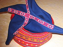
As for the lapland symbol, I was thinking you could maybe use a traditional Sámi hat -
Re: Scandinavia - Rev 18 - Aug 2010
Alright, here is next version.
I think a raindeer is better icon choice then a sami hat. Keeping it for now anyway.
What's changed:
- colors of north and south sweden, as per nattys suggestion.
- tried to make the icons more "icony" by first blending them into the background, then applying some shadow.
- applied texture to the ocean, but it's only with 5% opacity atm, so it can hardly be seen...
- shortened a few more "land" on the small map (Gästrikland and Västmanland)
[bigimg]http://www.cwebproduction.com/stuff/nordics-large-rev18.jpg[/bigimg]
[bigimg]http://www.cwebproduction.com/stuff/nordics-small-rev18.jpg[/bigimg]
Also tried the colorblind page again. Looks acceptable to me, I would certainly have no trouble telling which is which:
[bigimg]http://www.cwebproduction.com/stuff/deu_sim.jpg[/bigimg]
[bigimg]http://www.cwebproduction.com/stuff/pro_sim.jpg[/bigimg]
[bigimg]http://www.cwebproduction.com/stuff/tri_sim.jpg[/bigimg]
I don't need a 500px image in my signature because I don't have anything to compensate for.
-
natty dread
- Posts: 12877
- Joined: Fri Feb 08, 2008 8:58 pm
- Location: just plain fucked
Re: Scandinavia - Rev 18 - Aug 2010
South & central sweden are still too hard to tell apart.
Also if you abbreviate names on the small map you'll need a legend decoding the abbreviations...
Also if you abbreviate names on the small map you'll need a legend decoding the abbreviations...

Re: Scandinavia - Rev 18 - Aug 2010
I can see the difference between South and Central Sweden, and there is a bold border as well, so unless you can easily pick a more distinctive set of colours, I would not worry.
-
natty dread
- Posts: 12877
- Joined: Fri Feb 08, 2008 8:58 pm
- Location: just plain fucked
Re: Scandinavia - Rev 18 - Aug 2010
I can see it too, but I can also see that someone who sees the map for the first time will not necessarily see it.
-
RedBaron0
- Posts: 2657
- Joined: Sun Aug 19, 2007 12:59 pm
- Gender: Male
- Location: Pennsylvania
- Contact:
Re: Scandinavia - Rev 18 - Aug 2010
Agreed, fiddle with the hue between Central and Southern Sweden and see if they come up more distinctly under color blindness filters. Reindeer do look better, more in the image.
The land where the island of Aland is isn't colored to be part of the Finland bonuses.
The land where the island of Aland is isn't colored to be part of the Finland bonuses.
Re: Scandinavia - Rev 18 - Aug 2010
I can't make south any lighter/brighter so I'm going to try making north and central darker instead to get higher contrast between them.
I specifically removed the coloring a few versions ago to make it clearer that it's not included in west finland bonus. It sure ain't easy to please everyone...
In this case I really don't think that's necessary. It's only abbreviated on the small map and the only abbreviation that exist is "land" to "l." If you see "Uppland" in the list and "Uppl." on the map, surrounded by "Östergötland", "Södermanland" and "Hälsingland", and don't draw the connection... well, it's beyond me how you'd manage to play the game. I could of course add a small "l. = land" explanation but it would feel like an insult to the players intellect.
RedBaron0 wrote:The land where the island of Aland is isn't colored to be part of the Finland bonuses.
I specifically removed the coloring a few versions ago to make it clearer that it's not included in west finland bonus. It sure ain't easy to please everyone...
natty_dread wrote:Also if you abbreviate names on the small map you'll need a legend decoding the abbreviations...
In this case I really don't think that's necessary. It's only abbreviated on the small map and the only abbreviation that exist is "land" to "l." If you see "Uppland" in the list and "Uppl." on the map, surrounded by "Östergötland", "Södermanland" and "Hälsingland", and don't draw the connection... well, it's beyond me how you'd manage to play the game. I could of course add a small "l. = land" explanation but it would feel like an insult to the players intellect.
Last edited by CoolC on Fri Aug 13, 2010 7:57 pm, edited 2 times in total.
I don't need a 500px image in my signature because I don't have anything to compensate for.
Re: Scandinavia - Rev 19 - Aug 14 2010
I've made another adjustment to the colors. I can very easily tell the difference now even 3 meters away from the screen.
Also added a minimap (still a bit rough) instead of the old legend, but I've kept the legend on hidden layers for now. I am still visually preferring the list but I can also see how it's easier/faster with a minimap. If you think I should go with a minimap I would appreciate comments on it's design. Is the placement ok? Are the icons for laponia/baltic islands still needed?
Another thing I want feedback on his how to do Åland. It lack the blue finnish color on the map since it's not included in the sub-bonuses but only in the super-bonus. As an additional clarification it's mentioned in the legend (although not right now, since I forgot it when changing to mapmode). If it's not clear enough how it works there, how can I make it clearer?
LARGE map
[bigimg]http://www.cwebproduction.com/stuff/nordics-large-rev19.jpg[/bigimg]
SMALL map
[bigimg]http://www.cwebproduction.com/stuff/nordics-small-rev19.jpg[/bigimg]
I don't need a 500px image in my signature because I don't have anything to compensate for.
Re: Scandinavia - Rev 20 - Sep 20 2010 [Gp]
Reverted back to legend since I never really liked the mini-map much, and there was no comments saying otherwise. Made Åland once again in similar color as Finland, this time choosing a slightly brighter blue then east finland - that should make it clear enough that it doesn't belong to west finland. The only other change that made it this time was a slight change in contrast for the whole thing.
I've experiemented a bit with new sea borders and a compass(rose) instead of the north arrow but didn't get it any better then it currently is. Will continue and see if I can improve these two things. Nothing more ground breaking scheduled.
Maybe it's time to move this on to the final forge? Or isn't even the minor changes above allowed there?
LARGE map
[bigimg]http://www.cwebproduction.com/stuff/nordics-large-rev20.jpg[/bigimg]
SMALL map
[bigimg]http://www.cwebproduction.com/stuff/nordics-small-rev20.jpg[/bigimg]
I don't need a 500px image in my signature because I don't have anything to compensate for.
-
Victor Sullivan

- Posts: 6010
- Joined: Mon Feb 08, 2010 8:17 pm
- Gender: Male
- Location: Columbus, OH
- Contact:
Re: Scandinavia - Rev 20 - Sep 20 2010 [Gp]
I apologize in advance, as this was probably answered before, but I just didn't want to weed through all the posts. Isn't Nordic Countries that natty made the exact same thing as this?
-Sully
-Sully
[player]Beckytheblondie[/player]: "Don't give us the dispatch, give us a mustache ride."
Scaling back on my CC involvement...
Scaling back on my CC involvement...
-
natty dread
- Posts: 12877
- Joined: Fri Feb 08, 2008 8:58 pm
- Location: just plain fucked
Re: Scandinavia - Rev 20 - Sep 20 2010 [Gp]
Not really... Nordic countries is Scandinavia + Iceland. This is just Scandinavia.
The gameplay is very different too. I'm all for this map, I think CC can accommodate 2 maps of the area.
The gameplay is very different too. I'm all for this map, I think CC can accommodate 2 maps of the area.
-
Victor Sullivan
- Posts: 6010
- Joined: Mon Feb 08, 2010 8:17 pm
- Gender: Male
- Location: Columbus, OH
- Contact:
Re: Scandinavia - Rev 20 - Sep 20 2010 [Gp]
I see. Just as long as this is more graphically different, too I think it will stand out (which I think you've got that covered already, C (Get it? CoolC? Cuz it's a C that's a cool color? Well F you too).

Sully
Sully
[player]Beckytheblondie[/player]: "Don't give us the dispatch, give us a mustache ride."
Scaling back on my CC involvement...
Scaling back on my CC involvement...
-
the.killing.44

- Posts: 4724
- Joined: Thu Oct 23, 2008 7:43 pm
- Gender: Male
- Location: now tell me what got two gums and knows how to spit rhymes
- Contact:
Re: Scandinavia - Rev 20 - Sep 20 2010 [Gp]
Exact same bonuses…
-
Victor Sullivan
- Posts: 6010
- Joined: Mon Feb 08, 2010 8:17 pm
- Gender: Male
- Location: Columbus, OH
- Contact:
Re: Scandinavia - Rev 20 - Sep 20 2010 [Gp]
the.killing.44 wrote:Exact same bonuses…
Well theres only so much you can do, right? The same political boundaries, similare number of territories, similar bonuses... I agree that the bonus structures could stand to be different from the current, but we're already in Graphics, so it'd be cruel to send it back or scrap it.
-Sully
[player]Beckytheblondie[/player]: "Don't give us the dispatch, give us a mustache ride."
Scaling back on my CC involvement...
Scaling back on my CC involvement...
-
natty dread
- Posts: 12877
- Joined: Fri Feb 08, 2008 8:58 pm
- Location: just plain fucked
Re: Scandinavia - Rev 20 - Sep 20 2010 [Gp]
the.killing.44 wrote:Exact same bonuses…
I don't know what you're talking about...
Only Sweden has same bonuses as Nordic. Finland, Norway & Denmark are divided very differently.


Re: Scandinavia - Rev 20 - Sep 20 2010 [Gp]
CoolC wrote:Made Åland once again in similar color as Finland, this time choosing a slightly brighter blue then east finland - that should make it clear enough that it doesn't belong to west finland.
this is a definite improvement. åland is now clearly part of neither west finland nor central sweden. the previous colour looked far too green.
ian.

-
natty dread
- Posts: 12877
- Joined: Fri Feb 08, 2008 8:58 pm
- Location: just plain fucked
Re: Scandinavia - Rev 20 - Sep 20 2010 [Gp]
Small suggestion: swap Norway & Sweden in the legend so the countries go in the same order they go on the map (From left to right)
Re: Scandinavia - Rev 20 - Sep 20 2010 [Gp]
natty_dread wrote:Small suggestion: swap Norway & Sweden in the legend so the countries go in the same order they go on the map (From left to right)
Where does that leave Denmark? Maybe as is, reading countries left to right across the top of the map, then catching Denmark on the second pass, or maybe between Norway and Sweden?
-
Victor Sullivan
- Posts: 6010
- Joined: Mon Feb 08, 2010 8:17 pm
- Gender: Male
- Location: Columbus, OH
- Contact:
Re: Scandinavia - Rev 20 - Sep 20 2010 [Gp]
Also, bonus area names would be nice (besides the over-arching country bonuses).
[player]Beckytheblondie[/player]: "Don't give us the dispatch, give us a mustache ride."
Scaling back on my CC involvement...
Scaling back on my CC involvement...
Re: Scandinavia - Rev 20 - Sep 20 2010 [Gp]
Victor Sullivan wrote:Also, bonus area names would be nice (besides the over-arching country bonuses).
You mean like naming it "Svealand" instead of Central Sweden?
natty_dread wrote:Small suggestion: swap Norway & Sweden in the legend so the countries go in the same order they go on the map (From left to right)
Hmm, could do that. Right now I have them in order of largest to smallest (super)bonus, but maybe a geographical order is better. As ender says, Denmark would probably have to stay where it is then. Anyone else have an opinion on this? (edit: now that i check again, i see that only the superbonuses are in order of size, teh subbonuses are already geographical.)
iancanton wrote:this is a definite improvement. åland is now clearly part of neither west finland nor central sweden. the previous colour looked far too green.
Glad to hear it
I don't need a 500px image in my signature because I don't have anything to compensate for.