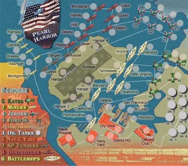
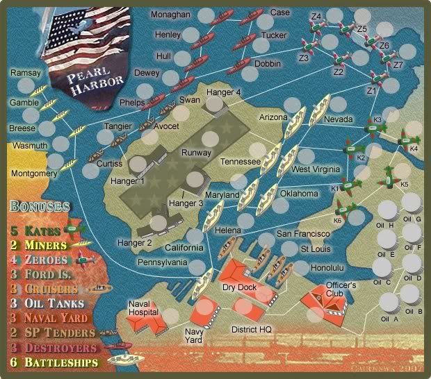
DiM wrote:1. at a first glance i saw the 3 ships in the bottom part next to the hospital and i wondered what the heck are they doing there not connected to anything. then i realized they're part of the legend. for me adding them does no good. the colours where good enough to figure everything out. but since you changed the airplanes i guess they are needed for katers and zeroes. to be frank i'd prefer you go back to the simple colour based legend but that would mean making kates and zeroes as distinct as before.
maybe leabe the kates as they are and for the zeroes replace green with blue and in the legend make the text blue with a red edge.
legend exanded, icons added.
2. you still have officers' club spelled wrong.
you have officer's club which means the club of a single officer
it should be officers' club which means the club of all the officers
fixed
3. the zone with battleships and cruisers seems a bit crowded and it might cause some confusion especially for the helena army circle.
army shadow moved, might close that dry dock underneath that army shadow if that become a prob when testing for numbers
4. the oil tanks have little white lines to give the impression of 3D but those lines look like tiny connectors that go nowhere.
outlined made black
5. the text glow should have the colour of the continent but only on some parts. for example miners or destroyers have the right glow but naval yard, fort is, kates, or zeroes don't.
fixed
6. if you decide to keep the icons in the legend then add all the icons, an oil tank, a red building and a runway bit.
all added
7. also i see you like to use a border for the map. it is nice but is also takes out 10-20 pixels of usable space, and those pixels could be used to uncramp some areas.
given to extra legend area