Bad Speler wrote:Inside the game, the players' names are underlined in blue. Before this update they were underlined in the players' respective colours. Anyone else see this?
Did everyone just ignore me? ^
mine does that too but i think it is better because it make the names stand out more
also the thing i dislike the most about the update is that the logout is now blue because i see the blue out of the corner of my eye and i think that i have a new pm but that is pretty minor and ill just have to get used to it
great job guys
petebob wrote:You should drop out of school immediately--it's impinging on your game!
also the thing i dislike the most about the update is that the logout is now blue because i see the blue out of the corner of my eye and i think that i have a new pm but that is pretty minor and ill just have to get used to it
great job guys
yeah i'm not sure why that logout link is there. its so blue and lonely...just out of place. also its font size increases when you go from the game menu to the forum. just thought i'd point that out. i dunno i think it should go back to where it was but no big deal. overall...an excellent update. hope to see the monkey return soon!
Alot of these changes are great, but I am in quite a few games and am having the "black dot" by everyones name problem. i have to look through log to see who has went this round....anyway to fix this?
Last edited by Julia Gulia on Tue Sep 19, 2006 9:40 pm, edited 1 time in total.
All I have is black dots in the players area.. it doesnt show whos turn it is anymore.. atleast on my comp using Firefox.. anyone else have that problem?
yea i have the same problem with firefox, will this be fixed soon??
hasaki wrote:All I have is black dots in the players area.. it doesnt show whos turn it is anymore.. atleast on my comp using Firefox.. anyone else have that problem?
yea i have the same problem with firefox, will this be fixed soon??
am i the only one that finds this new layout annoying as shit. the dice are too damn big and just piss me off. other than that its all about as fucking dumb
excellent! Funny I was only just wishing for an autoattack button a few days ago when chatting to my brother.
Not sure I like the graphical dice too much and they add a little lag on slower connections, but other than that reckon it's great
I've got to agree with this part. To see how the roll went I have to scroll right. I'm sure all of the other changes will just take getting used to. I truly like the fact that lack cares enough to keep updating things.
Bad Speler wrote:Inside the game, the players' names are underlined in blue. Before this update they were underlined in the players' respective colours. Anyone else see this?
Did everyone just ignore me? ^
mine does that too but i think it is better because it make the names stand out more
also the thing i dislike the most about the update is that the logout is now blue because i see the blue out of the corner of my eye and i think that i have a new pm but that is pretty minor and ill just have to get used to it
great job guys
I like the blue underline, it tells me whether ive seen that persons profile. I also dont like the logout button and have the black dot issue.


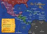 MIDDLE AMERICA MAP