[Abandoned] - Welcome to mars!
Moderator: Cartographers
Forum rules
Please read the Community Guidelines before posting.
Please read the Community Guidelines before posting.
-
LED ZEPPELINER
- Posts: 1088
- Joined: Tue Nov 25, 2008 10:09 pm
Re: Welcome to mars! oaktown tinkered, p. 2
don't you think that if there was water on mars, the land would be much more lush and green,
sailorseal wrote:My big boy banana was out the whole time
AndyDufresne wrote:Forever linked at the hip's-banana! (That sounds strange, don't quote me.)AndyDufresne wrote:Many Happy Bananas to everyone, lets party...with Bananas.
--Andy

Re: Welcome to mars! oaktown tinkered, p. 2
actually, it would not be very green at all - there's no plant life on mars, and life doesn't come from no where. However, if humanity moved to mars, we would bring plants with us. So there would probably be cities with slowly growing green areas around them. maybe each terit could have a city in it, and each city could have a diff sized green(er(ish)) area around it?

Re: Welcome to mars! oaktown tinkered, p. 2
oaktown wrote:Maybe because seas are prettier?
Well let's just agree to disagree on that one.
-
Balsiefen

- Posts: 2299
- Joined: Wed Aug 30, 2006 6:15 am
- Gender: Male
- Location: The Ford of the Aldar in the East of the Kingdom of Lindissi
- Contact:
Re: Welcome to mars! oaktown tinkered, p. 2
This map is an absolute classic.
I think the gameplay should stand as is, It looks a good map to me.
Graphics wise, you need to change the colours for Elysium and Sirenium: far too similar both to each other and the background.
You might also need something to signify Lomses connection to Aonia on the Lomse side of the board.
I think the gameplay should stand as is, It looks a good map to me.
Graphics wise, you need to change the colours for Elysium and Sirenium: far too similar both to each other and the background.
You might also need something to signify Lomses connection to Aonia on the Lomse side of the board.
-
Incandenza

- Posts: 4949
- Joined: Thu Oct 19, 2006 5:34 pm
- Gender: Male
- Location: Playing Eschaton with a bucket of old tennis balls
Re: Welcome to mars! oaktown tinkered, p. 2
I'm very much part of the prevailing sentiments here:
1. gameplay looks fine
2. graphics could use some work, maybe add a few little green men
Good stuff.
1. gameplay looks fine
2. graphics could use some work, maybe add a few little green men
Good stuff.
THOTA: dingdingdingdingdingdingBOOM
Te Occidere Possunt Sed Te Edere Non Possunt Nefas Est
Te Occidere Possunt Sed Te Edere Non Possunt Nefas Est
-
Mr. Squirrel

- Posts: 157
- Joined: Fri Nov 02, 2007 3:18 pm
- Location: up a tree
Re: Welcome to mars! oaktown tinkered, p. 2
Is it just me, or is this the exact same gameplay as classic, just flipped upside down?

Re: Welcome to mars! oaktown tinkered, p. 2
Mr. Squirrel wrote:Is it just me, or is this the exact same gameplay as classic, just flipped upside down?
-
Merciless Wong
- Posts: 199
- Joined: Wed Feb 06, 2008 8:12 pm
Re: Welcome to mars! oaktown tinkered, p. 2
So what's wrong with that?
I have trouble recognizing continents in this picture...
I have trouble recognizing continents in this picture...

Re: Welcome to mars! oaktown tinkered, p. 2
[Moved]
It would appear that development of this map has stalled. If the mapmaker wants to continue with the map, then one of the CAs will be able to help put the thread back into the Foundry system, after an update has been made.
It would appear that development of this map has stalled. If the mapmaker wants to continue with the map, then one of the CAs will be able to help put the thread back into the Foundry system, after an update has been made.

PB: 2661 | He's blue... If he were green he would die | No mod would be stupid enough to do that
-
gimil

- Posts: 8599
- Joined: Sat Mar 03, 2007 12:42 pm
- Gender: Male
- Location: United Kingdom (Scotland)
Re: Welcome to mars! oaktown tinkered, p. 2
Ok me and oaktown are back on the case and will be trying to get this one going!
This update has the following from oaktowns tinkering image:
1. Changed font for terr names, added a bevel and a brighter stroke to all terr names.
2. Removed the ugly compass
3. Added slight bevel to borders to add a little 'pop'
4. Added a new (more fitting) water texture.
5. Other minor tinkers.
[bigimg]http://i25.photobucket.com/albums/c64/Gimil_01/Mars03copy-1.png[/bigimg]
[moved]
What do you know about map making, bitch?
Top Score:2403
natty_dread wrote:I was wrong
Top Score:2403
Re: Welcome to mars! Update p. 3
The path from Albor - does it go to Olympus or Biblis Patera? That could do with tidying up/clarifying a little.
I still have my doubts about the concept of a terraformed Mars map - it does look better than a straight-up red map of mars, but it feels a little weird. You've added the backstory, so perhaps that covers it? I'm not sure though?
The concentric circles and rockets/missiles are classic touches... nice work
PB: 2661 | He's blue... If he were green he would die | No mod would be stupid enough to do that
-
sailorseal

- Posts: 2735
- Joined: Sun May 25, 2008 1:49 pm
- Gender: Male
- Location: conquerclub.com
Re: Welcome to mars! Update p. 3
Alright, I still feel like someone took the darken tool to this map, maybe they did, could you brighten it a pinch? 
I kind of like the space ships, I am not sure, kind of on the fence so I say keep them for now.
I would change it so there is a red line around the red territory area, a blue around the blue, etc.
I just noticed the background and love it.
Great Map!
I kind of like the space ships, I am not sure, kind of on the fence so I say keep them for now.
I would change it so there is a red line around the red territory area, a blue around the blue, etc.
I just noticed the background and love it.
Great Map!
-
Industrial Helix

- Posts: 3462
- Joined: Mon Jul 14, 2008 6:49 pm
- Gender: Female
- Location: Ohio
Re: Welcome to mars! Update p. 3
1) Maybe add some space camps or something like that? Perhaps like feudal war.
2) Drive the story. I echo Mr. Benn when it seems dodgy already but I think with a winning story line or concept It should work out rather well. btw... what exactly are solar rains? Does the sun rain? I'm just giving you a hard time with the last bit, its sci-fi, anything goes.
3) I second the darkness, It needs some brightening up.
4) The font is a tad difficult to read, it's not impossible, but another sci fi font would be cool.
Sketchblog [Update 07/25/11]: http://indyhelixsketch.blogspot.com/
Living in Japan [Update 07/17/11]: http://mirrorcountryih.blogspot.com/
Russian Revolution map for ConquerClub [07/20/11]: viewtopic.php?f=241&t=116575
Living in Japan [Update 07/17/11]: http://mirrorcountryih.blogspot.com/
Russian Revolution map for ConquerClub [07/20/11]: viewtopic.php?f=241&t=116575

Re: Welcome to mars! Update p. 3
Industrial Helix wrote: I second the darkness, It needs some brightening up.
Third.
Mainly all the text. The landscape will look okay if the text wasn't so dark.

Re: Welcome to mars! Update p. 3
RjBeals wrote:Industrial Helix wrote: I second the darkness, It needs some brightening up.
Third.
Mainly all the text. The landscape will look okay if the text wasn't so dark.
Agreed.
The land color is fine, it's the color it's supposed to be. The text color (Both the text itself and the colors surrounding it), as well as the ocean color (Which looks almost purple), could use some brightening. It might not hurt to brighten the title a bit also.

Re: Welcome to mars! Update p. 3
so far we have drive the story, make some borders/connections more clear, make the text easir to read, and work on the overall darkness of the map... noted. Gimil and I are playing tennis with this map right now, and I've agreed to make the next update. I'll see what I can come up with this weekend.

-
dolomite13

- Posts: 1379
- Joined: Mon Aug 18, 2008 5:54 pm
Re: Welcome to mars! oaktown tinkered, p. 2
Mr. Squirrel wrote:Is it just me, or is this the exact same gameplay as classic, just flipped upside down?
Yep it certainly is. But that gameplay has proven to be very good. I am always in favor of seeing alternative takes on the "classic" map. I really like how this map is progressing =)
--D
Where Have I Been? ... Testing a prototype board game that I co-designed called Alien Overrun!

Re: Welcome to mars! Update p. 3
Not a big fan of the game map as it is now. More Mars-like maybe?
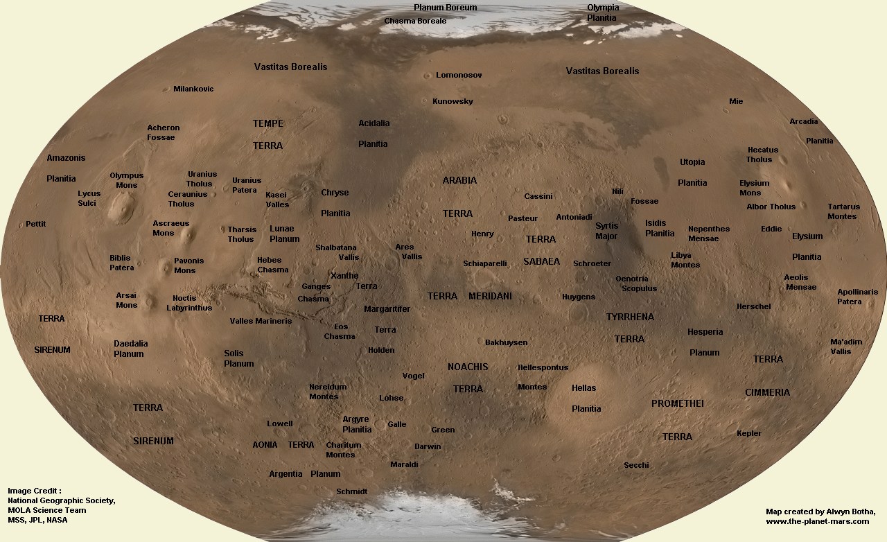
http://www.hjo3.net/mars_map_botha.jpg
http://www.hjo3.net/mars_map_botha.jpg
Gengoldy wrote:Of all the games I've played, and there have been some poor sports and cursing players out there, you are by far the lowest and with the least class.

Re: Welcome to mars! Update p. 3
It's hard to tell if this was actually colonized or if the martians are staying, about 75% of the names sound made up the rest look like cities and countries from different eras.
Olympus
Darwin
Arabian Terra
Olympus
Darwin
Arabian Terra
MrBenn wrote:On an a side-note, as a child I used to have a recurring nightmare about being chased round a supermarket by a crocodile pushing a shopping trolley and wearing an "I ♥ Shopping" t-shirt...
-----Spanish Civil War: Vacationed

Re: Welcome to mars! Update p. 3
The color of the land is fine. I would prefer a greater contrast between region colors and region names. That may involve brightening or not. Promethi's is correctly contrasted Also, the region color for Elysium and Sirenum are very close, perhaps blue would distinguish them better.
I think the flavor text is fine. If you must change it, typical terraforming schemes involve bombarding Mars with comets.
When finished, I will definately play on this map rather than classic shapes. Thanks gimil and oaktown.
I think the flavor text is fine. If you must change it, typical terraforming schemes involve bombarding Mars with comets.
When finished, I will definately play on this map rather than classic shapes. Thanks gimil and oaktown.
Re: Welcome to mars! Update p. 3
Is this an attempt at a revamp of Classic Shapes or something?
MrBenn wrote:On an a side-note, as a child I used to have a recurring nightmare about being chased round a supermarket by a crocodile pushing a shopping trolley and wearing an "I ♥ Shopping" t-shirt...
-----Spanish Civil War: Vacationed
-
Militiaman
- Posts: 3
- Joined: Thu Feb 26, 2009 1:46 pm
- Gender: Male
- Location: Bloomington Indiana
Re: Welcome to mars! Update p. 3
Looks like a nice map. I can't wait to play on it.
-
Teflon Kris

- Posts: 4236
- Joined: Sun Jul 13, 2008 4:39 pm
- Gender: Male
- Location: Lancashire, United Kingdom
Re: Welcome to mars! Update p. 3
Hi gimil
Great map concept, looking good so far.
One small point, from a TO prespective:
More space setting maps = millions of interesting tournaments
It would be great if the map were dateless as this would allow more flexibiity in terms of consistency with potential tournament ideas .
Just a thought.
Great map concept, looking good so far.
One small point, from a TO prespective:
More space setting maps = millions of interesting tournaments
It would be great if the map were dateless as this would allow more flexibiity in terms of consistency with potential tournament ideas .
Just a thought.
-
gimil
- Posts: 8599
- Joined: Sat Mar 03, 2007 12:42 pm
- Gender: Male
- Location: United Kingdom (Scotland)
Re: Welcome to mars! Update p. 3
DJ Teflon wrote:Hi gimil
Great map concept, looking good so far.
One small point, from a TO prespective:
More space setting maps = millions of interesting tournaments
It would be great if the map were dateless as this would allow more flexibiity in terms of consistency with potential tournament ideas .
Just a thought.
Dateless? There would still have to be a story/theme to justify water on Mars but I suppose we can work around the date.
Oaktown is due to do the next update, which I am expecting to be a big one!
What do you know about map making, bitch?
Top Score:2403
natty_dread wrote:I was wrong
Top Score:2403
-
hecter

- Posts: 14632
- Joined: Tue Jan 09, 2007 6:27 pm
- Gender: Female
- Location: Tying somebody up on the third floor
- Contact:
Re: Welcome to mars! Update p. 3
It'd be nice if the circle things in the water were toned down a bit.
In heaven... Everything is fine, in heaven... Everything is fine, in heaven... Everything is fine... You got your things, and I've got mine.
