Page 3 of 3
Posted: Thu Jan 25, 2007 5:08 pm
by happysadfun
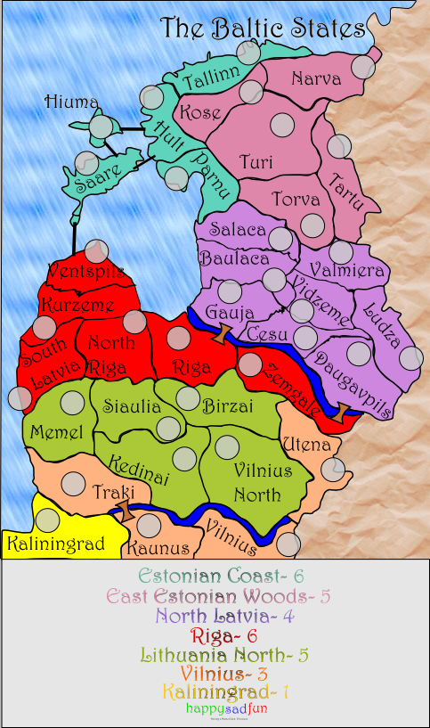
Got rid of old image! Better?
Posted: Thu Jan 25, 2007 5:16 pm
by Fitz69
Way better! the lettering typeface is sweet. A bit on the large side maybe.
The bridges to the islands now need strengthening and the legend is still a bit too low-contrast though.
Posted: Thu Jan 25, 2007 6:56 pm
by Guiscard
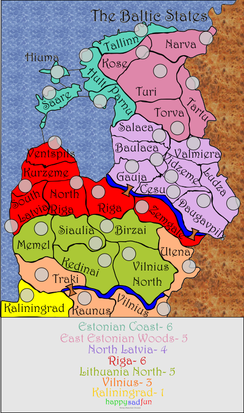
Looking much better. Names are pretty big, though, and the brown texture looks like someone hot chocolate all over it. Maybe something a bit more subtle?
Posted: Thu Jan 25, 2007 10:27 pm
by btownmeggy
I still can't tell what territories are actually what countries. This has no effect on playability, but it would make the map more interesting and more educational.
I don't like the water texture.
The main title needs to be more visible, as do some of names in the legend (maybe try adding a shadow).
Posted: Fri Jan 26, 2007 6:21 pm
by happysadfun
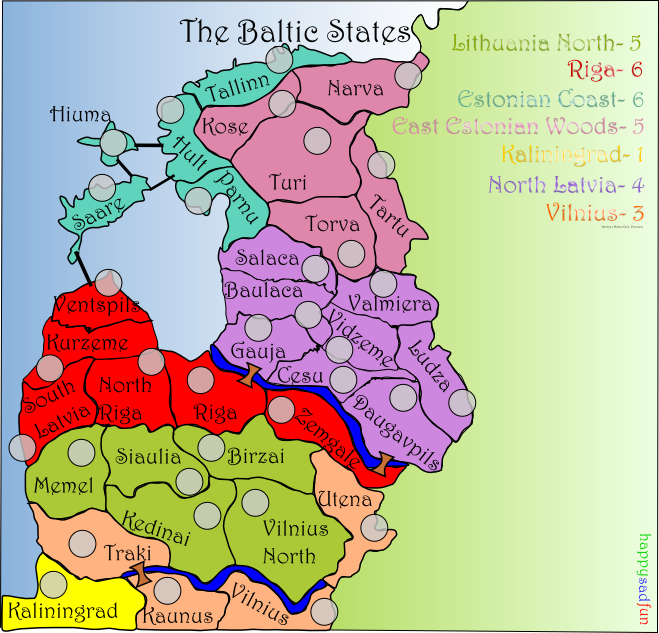
Here's what I'm doing on the next draft:
- Adding a black gradient to legend names stroke to see it better
- Darkening North Latvia's purple
- Changing the background textures
- Making sea connections thicker
Posted: Fri Jan 26, 2007 6:54 pm
by happysadfun
Posted: Fri Jan 26, 2007 6:56 pm
by AndyDufresne
I'm not really sure what to make of the map right now, I'll digest it a little more.
One thing I will say, the bonus legend on the bottom, I'm not feeling it. It can work on some maps, Hong Kong was a good example, and the Senate map also, but with the current lay out, I don't think it's a good idea.
--Andy
Posted: Fri Jan 26, 2007 7:00 pm
by Ruben Cassar
Honestly, I think you should build on this map I gave you on page 2. It's much better!

Posted: Sat Jan 27, 2007 12:25 am
by Fitz69
I agree. Rubens map is the way to go.
Posted: Sat Jan 27, 2007 1:13 am
by gavin_sidhu
This is definately the best map you have created, i like the font, rivers and bridges, different feel to all the other maps, the texture of non map areas seems out of place and the key definately needs to be changed. Whats up wit Saare, why is their a split in the country at the bottom? parts of the map dont have the ocean font, like the area in Tallinn and The line between Saare and Hult.
Posted: Fri Feb 02, 2007 8:47 pm
by happysadfun
3.11
 3.12
3.12
(It will be white later, it should be only it's a PNG)
VOTE!!
Posted: Fri Feb 02, 2007 10:05 pm
by gavin_sidhu
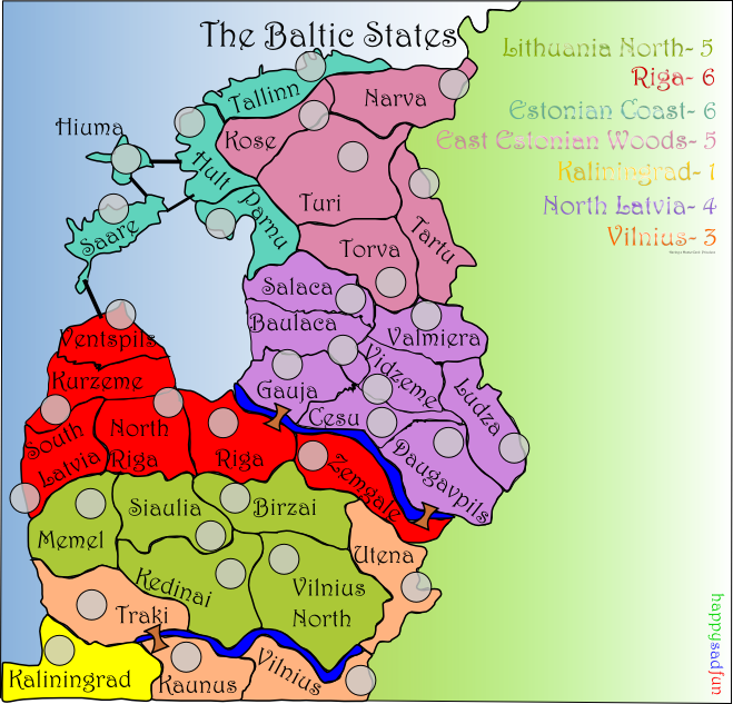
...half the map doesn't even take up half the space of the map. The bottom of the map is cramped, the same with the west of the map, but the east has massive space.
I think that if you want to add space like you have, you should add it on the west instead of the east, show the ocean.
Posted: Sat Feb 03, 2007 11:05 am
by Ruben Cassar
Ruben Cassar wrote:Honestly, I think you should build on this map I gave you on page 2. It's much better!
Posted: Sat Feb 03, 2007 12:19 pm
by Balsiefen
gavin_sidhu wrote:...half the map doesn't even take up half the space of the map. The bottom of the map is cramped, the same with the west of the map, but the east has massive space.
I think that if you want to add space like you have, you should add it on the west instead of the east, show the ocean.
I agree try moving it over and putting the legend in the sea
also you should extend the bottom a bit so it doesent look cut off