South Africa Map - Back On Track?
Moderator: Cartographers
Forum rules
Please read the Community Guidelines before posting.
Please read the Community Guidelines before posting.


-
Nikita_2006
- Posts: 486
- Joined: Thu Oct 19, 2006 8:35 am
-
Bad Speler

- Posts: 1027
- Joined: Fri Jun 02, 2006 8:16 pm
- Gender: Male
- Location: Ottawa
- Contact:
The legend doesn't bother me much. Either place works for me - I just thought it might be a good idea if the 2 'legends' were next to each other.
What I need now playability feedback and support from people who think this is going in the right direction.
Should the one way attack routes stay in? I think it adds another dimention to an otherwise pretty 'flat' map.
Mountain range changes? I could put in the whole escarpment (which would be more geographically correct, but maybe not good for playability). This would put Western and Eastenr Cape plus KZN behind a wall of mountains.
River changes?
Are the bonuses OK?
-
Bad Speler
- Posts: 1027
- Joined: Fri Jun 02, 2006 8:16 pm
- Gender: Male
- Location: Ottawa
- Contact:
-
Nikita_2006
- Posts: 486
- Joined: Thu Oct 19, 2006 8:35 am

-
Nikita_2006
- Posts: 486
- Joined: Thu Oct 19, 2006 8:35 am
Crowley wrote:Buggered around with the legend again and added a new image with a larger escarpment.
Also added a little splash of fun...
Any thoughts?
I like that picture, but the background of the legends looks almost the same as the color of the land under it. And sorry that I say it again but I don't like the flag at this moment. Don't change to offten, and wait for feedback of others.
-
wrightfan123

- Posts: 601
- Joined: Sat Jan 06, 2007 2:58 pm
- Gender: Male
- Location: Looking over every baseball team's schedule to try to determine who will win the World Series.
- Contact:
Nikita_2006 wrote:I like that picture, but the background of the legends looks almost the same as the color of the land under it. And sorry that I say it again but I don't like the flag at this moment. Don't change to offten, and wait for feedback of others.
It's no worries - changes are really easy to make and just as easy to undo, so I'm just playing around alot. Sure, feedback is important, but it has to look good to me...
The legends are supposed to blend a bit better with the background. But obviously if no-one likes that, it can be cahnged.
I'll play around with the flag and name tomorrow...
-
Nikita_2006
- Posts: 486
- Joined: Thu Oct 19, 2006 8:35 am

Nikita_2006 wrote:onbekende wrote:Other internet stuff, and some school
always good my advice is heared
Glad your back, we missed you on this forum.
And Wisse and Marval where are those guys, work to do on this map.
i am here,
you nee to thinner your rivers and make your army shades bigger
and than try to make better bridges & arrows


-
Ruben Cassar

- Posts: 2160
- Joined: Thu Nov 16, 2006 6:04 am
- Gender: Male
- Location: Civitas Invicta, Melita, Evropa
I do not have time to go through all the thread so excuse me if some of the things I am going to mention have already been discussed.
The map is looking good but there is still a lot of work to do. I am assuming that the first image in the thread is the most recent update. (if not I suggest putting the most recent version of the map at the start of the thread because it can be confusing)
1. The new legend is not legible enough on that background. I can barely read Swaziland in Yellow. You have to change the background of the legend I think. Personally I would also prefer the names of the continents to be straight and not italic but that's only a matter of taste.
2. The names of the oceans do not look good. Try using a different font and do not tilt them because I get a feeling of Wordart when I look at them which is not good.
3. The 'faded' texture of the sea does not entirely convince me. Maybe you can work a bit more on that giving some other (more wavy) alternatives?
4. I am not a big fan of the bridges. Can you try using some better looking ones (maybe wood bridges)?
5. The territory borders in Mpumalanga (Pink) are not clear enough. I think I would stick to one colour for the borders for all the map. White or black perhaps?
6. I think I would remove the mountain passes. It defeats the purpose of using the mountains as an impassable object.
7. I would consider topping the bonus for holding all 3 port cities to +2.
8. Other bonuses (I would make these changes considering mountains as impassable):
Eastern Cape +5
Freestate +4


-
DiM

- Posts: 10415
- Joined: Wed Feb 14, 2007 6:20 pm
- Gender: Male
- Location: making maps for scooby snacks
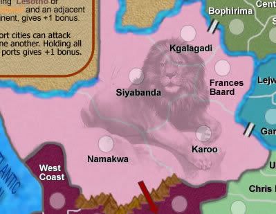
i agree with what ruben said and one more thing. i don't like the animals at the top.
consider putting animals something like this:
consider putting animals something like this:
“In the beginning God said, the four-dimensional divergence of an antisymmetric, second rank tensor equals zero, and there was light, and it was good. And on the seventh day he rested.”- Michio Kaku

-
Ruben Cassar
- Posts: 2160
- Joined: Thu Nov 16, 2006 6:04 am
- Gender: Male
- Location: Civitas Invicta, Melita, Evropa
Crowley wrote:Ruben Cassar wrote:I get a feeling of Wordart when I look at them
OH GOD! That will change ASAP then...
Hmm is that sarcasm? I only left feedback because Nikita asked me to via a pm. However out from that long post I sent you this is the only part you decided to reply to.
I hope I did not waste my time writing you that long post and that the feedback is at least appreciated...
-
Nikita_2006
- Posts: 486
- Joined: Thu Oct 19, 2006 8:35 am
-
Ruben Cassar
- Posts: 2160
- Joined: Thu Nov 16, 2006 6:04 am
- Gender: Male
- Location: Civitas Invicta, Melita, Evropa