Updates 11/23/13 - Championships, AutoTournaments, Zombies++
Moderator: Community Team
Forum rules
Please read the Community Guidelines before posting.
Please read the Community Guidelines before posting.

Re: Updates 11/23/13 - Championships, AutoTournaments, Zombi
Yeah, but how many users does that ebay site even have? I've never heard of it. I spent a couple minutes clicking around and couldn't find out anything about what types of games are even on that site.

Re: Updates 11/23/13 - Championships, AutoTournaments, Zombi
agentcom wrote:Yeah, but how many users does that ebay site even have? I've never heard of it. I spent a couple minutes clicking around and couldn't find out anything about what types of games are even on that site.
more than 600 thousand
░▒▒▓▓▓▒▒░
Re: Updates 11/23/13 - Championships, AutoTournaments, Zombi
I thought CC had been hijacked, when I saw the front page.
Sorry to say but it is just awful. It's difficult to believe there is a good strategy game hiding behind it. There was nothing wrong with the old one. Rather bring that back than this.
Sorry to say but it is just awful. It's difficult to believe there is a good strategy game hiding behind it. There was nothing wrong with the old one. Rather bring that back than this.
Re: Updates 11/23/13 - Championships, AutoTournaments, Zombi
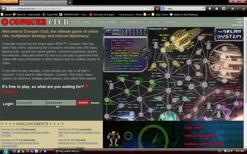
Here's a screenshot:
The visible announcements go from Nov 24 to Nov 3. The map looks like it doesn't fit. Remind
me is on two different lines.
It seems that the developers have bbs syndrome. BBS plays CC inside an imax theatre, so his resolution is so huge he doesn't notice the rest of us. also, the extra pictures take time to load, and of course there is the login box problem.
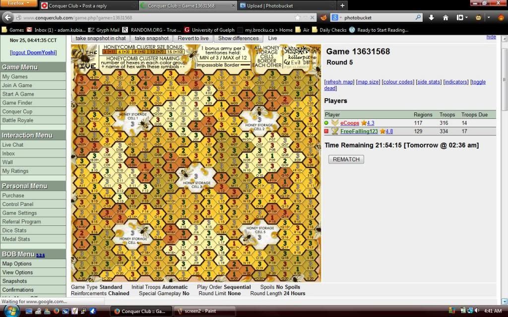
Also, here is a screen comparison of the sidebar thickness:
we can see here that the new bar takes up less space. due to its clunky appearance, it looks like it takes up more.
The visible announcements go from Nov 24 to Nov 3. The map looks like it doesn't fit. Remind
me is on two different lines.
It seems that the developers have bbs syndrome. BBS plays CC inside an imax theatre, so his resolution is so huge he doesn't notice the rest of us. also, the extra pictures take time to load, and of course there is the login box problem.
Also, here is a screen comparison of the sidebar thickness:
we can see here that the new bar takes up less space. due to its clunky appearance, it looks like it takes up more.
░▒▒▓▓▓▒▒░
-
lord voldemort

- Posts: 9596
- Joined: Sat Oct 20, 2007 4:39 am
- Gender: Male
- Location: Launceston, Australia
- Contact:

Re: Updates 11/23/13 - Championships, AutoTournaments, Zombi
LEft menu just annoyed me into making stupid moves in games, I can't bare it, looks like someone is eyeing me the whole time, the balance between left and right side is no more.
Re: Updates 11/23/13 - Championships, AutoTournaments, Zombi
Sorry to say it, but this site now looks like a site I would normally avoid in fear of getting viruses on my comp.
Also, I'm not comfortable browsing it in a public space. I think many CC's play at work, perhaps the design would benefit from reflecting that? You know, a cleaner, less "gamey" look.
I second what others have said: talking to a graphic designer would be very well worth it!
Also, I'm not comfortable browsing it in a public space. I think many CC's play at work, perhaps the design would benefit from reflecting that? You know, a cleaner, less "gamey" look.
I second what others have said: talking to a graphic designer would be very well worth it!
-
Qwert

- SoC Training Adviser
- Posts: 9262
- Joined: Tue Nov 07, 2006 5:07 pm
- Location: VOJVODINA
- Contact:
Re: Updates 11/23/13 - Championships, AutoTournaments, Zombi
now its look like MajorCommand site,,and this its what we want to avoid.


Re: Updates 11/23/13 - Championships, AutoTournaments, Zombi
DoomYoshi wrote:agentcom wrote:Yeah, but how many users does that ebay site even have? I've never heard of it. I spent a couple minutes clicking around and couldn't find out anything about what types of games are even on that site.
more than 600 thousand
His post was tongue in cheek
Highest Rank: 26 Highest Score: 3480

Re: Updates 11/23/13 - Championships, AutoTournaments, Zombi
I'm a big fan of the responsiveness. Here's a good example of a clean, responsive site: http://utah.gov/index.html
I also like the idea of a competition for the homepage revamp.
Also, also, how about using the transparent logo for the favicon?

I also like the idea of a competition for the homepage revamp.
Also, also, how about using the transparent logo for the favicon?
Last edited by The Voice on Mon Nov 25, 2013 10:10 am, edited 1 time in total.
-
AndyDufresne

- Posts: 24935
- Joined: Fri Mar 03, 2006 8:22 pm
- Location: A Banana Palm in Zihuatanejo
- Contact:
Re: Updates 11/23/13 - Championships, AutoTournaments, Zombi
It sure is...something!
--Andy
--Andy
-
Butters1919

- Posts: 974
- Joined: Sun Dec 16, 2007 8:40 am
Re: Updates 11/23/13 - Championships, AutoTournaments, Zombi
The statement that there are over 600000 players is an outright lie.
-
lokisgal

- SoC Training Adviser
- Posts: 1518
- Joined: Sat Mar 17, 2007 8:11 pm
- Location: Clowns to the left of me Jokers to the right...
Re: Updates 11/23/13 - Championships, AutoTournaments, Zombi
Thanks for posting this - this is exactly what I see as well and its awful. Please please change it back -it squishes things it just is visually painful. And please consider consulting with a graphic designer not a web designer on visual changes especially the front page and this side bar issue
Big Wham you said
Also one last thing. When I navigate away from CC to another page even for just a moment when I come back I have to log in again. I used to be able to surf around and come back and still be logged in. Is this intentional or a programming issue?
Thanks!
Big Wham you said
But you can see from Yoshi's screen shots it is indeed differentthe menu on the left did not change size. it is possible there is something odd with your setup. pm me a screen shot if you wish.
Also one last thing. When I navigate away from CC to another page even for just a moment when I come back I have to log in again. I used to be able to surf around and come back and still be logged in. Is this intentional or a programming issue?
Thanks!
DoomYoshi wrote:Here's a screenshot:
The visible announcements go from Nov 24 to Nov 3. The map looks like it doesn't fit. Remind
me is on two different lines.
It seems that the developers have bbs syndrome. BBS plays CC inside an imax theatre, so his resolution is so huge he doesn't notice the rest of us. also, the extra pictures take time to load, and of course there is the login box problem.
Also, here is a screen comparison of the sidebar thickness:
we can see here that the new bar takes up less space. due to its clunky appearance, it looks like it takes up more.


Re: Updates 11/23/13 - Championships, AutoTournaments, Zombi
From my experience it appears that this is not the case. Rather the home page looks exactly the same whether or not you are logged in. If you click on one of the menu links you will still be logged in. A change is needed there, but not the one you thought I guess.lokisgal wrote:Also one last thing. When I navigate away from CC to another page even for just a moment when I come back I have to log in again. I used to be able to surf around and come back and still be logged in. Is this intentional or a programming issue?
-
happy2seeyou

- Posts: 4021
- Joined: Mon Jan 22, 2007 2:59 pm
- Gender: Female
- Location: A state that is in the shape of a mitten!
- Contact:
Re: Updates 11/23/13 - Championships, AutoTournaments, Zombi
The new homepage looks like a toddler vomited it out.

-
iAmCaffeine

- Posts: 11699
- Joined: Mon Apr 01, 2013 5:38 pm
Re: Updates 11/23/13 - Championships, AutoTournaments, Zombi
Not a huge fan of Zombie spoils but that's a big deal really.
Just wondering what Membership=F means? Nobody can join the 1v1 Championship yet?
Just wondering what Membership=F means? Nobody can join the 1v1 Championship yet?


Re: Updates 11/23/13 - Championships, AutoTournaments, Zombi
iAmCaffeine wrote:Not a huge fan of Zombie spoils but that's a big deal really.
Just wondering what Membership=F means? Nobody can join the 1v1 Championship yet?
Free members.


Re: Updates 11/23/13 - Championships, AutoTournaments, Zombi
Priorty #1 A New, New Home Page, me thinks 

We are the Fallen, an unstoppable wave of Darkness.
-
iAmCaffeine
- Posts: 11699
- Joined: Mon Apr 01, 2013 5:38 pm
Re: Updates 11/23/13 - Championships, AutoTournaments, Zombi
Gilligan wrote:iAmCaffeine wrote:Not a huge fan of Zombie spoils but that's a big deal really.
Just wondering what Membership=F means? Nobody can join the 1v1 Championship yet?
Free members.
That would make sense..
Re: Updates 11/23/13 - Championships, AutoTournaments, Zombi
I love the irony of AssLux tournament being on doodle earth
░▒▒▓▓▓▒▒░

Re: Updates 11/23/13 - Championships, AutoTournaments, Zombi
The new front page is hideous. I really, really can't see this remaining for more than a week. I don't quite know how it got past the design phase.
Last edited by niMic on Mon Nov 25, 2013 4:53 pm, edited 1 time in total.

Highest score: 3772
Highest rank: 15
-
Shannon Apple

- Chatter

- Posts: 2182
- Joined: Wed Jan 14, 2009 8:40 pm
- Gender: Female
- Location: Ireland
Re: Updates 11/23/13 - Championships, AutoTournaments, Zombi
lokisgal wrote:Thanks for posting this - this is exactly what I see as well and its awful. Please please change it back -it squishes things it just is visually painful. And please consider consulting with a graphic designer not a web designer on visual changes especially the front page and this side bar issue
Big Wham you saidBut you can see from Yoshi's screen shots it is indeed differentthe menu on the left did not change size. it is possible there is something odd with your setup. pm me a screen shot if you wish.
Also one last thing. When I navigate away from CC to another page even for just a moment when I come back I have to log in again. I used to be able to surf around and come back and still be logged in. Is this intentional or a programming issue?
Thanks!DoomYoshi wrote:Here's a screenshot:
The visible announcements go from Nov 24 to Nov 3. The map looks like it doesn't fit. Remind
me is on two different lines.
It seems that the developers have bbs syndrome. BBS plays CC inside an imax theatre, so his resolution is so huge he doesn't notice the rest of us. also, the extra pictures take time to load, and of course there is the login box problem.
Also, here is a screen comparison of the sidebar thickness:
we can see here that the new bar takes up less space. due to its clunky appearance, it looks like it takes up more.
I'm going to just echo everyone else's sentiment here and say that the front page is terribad. I'm actually not into slamming someone's work, but in this case, it's the number one thing new users will see and you want them to stay. The problem is that the user is being bombarded with way too much at once. You've got 4 sections which are visually unrelated. It needs to look like it's all one page. I dunno what to advise right now off the top of my head, but yeah, I see why people are being really mean towards it.
The sidebars and things are not that big of an issue and it's just a matter of tidying it a little. The text is way too close to the edge of the page, almost like your trying to save room and makes it look wider than it actually is. It needs to feel like it can breathe. This is something I quickly edited in PS (and I mean literally done in a few seconds so a bit messy) just to show what I mean and not at all saying it should look like this, more of an example. Easier to explain visually and actually more like the original.

Bring the the "Game Menu" "Personal Menu" etc point size down a bit if you need more room in the bars, don't squish things up to make room as it takes away from the look. I am a graphic designer, so just giving you some genuine advice. Good luck.
00:33:53 ‹riskllama› will her and i ever hook up, LLT???
00:34:09 ‹LiveLoveTeach› You and Shannon?
00:34:20 ‹LiveLoveTeach› Bahahahahahaha
00:34:22 ‹LiveLoveTeach› I doubt it
00:34:30 ‹LiveLoveTeach› I don't think she's into farm animals
00:34:09 ‹LiveLoveTeach› You and Shannon?
00:34:20 ‹LiveLoveTeach› Bahahahahahaha
00:34:22 ‹LiveLoveTeach› I doubt it
00:34:30 ‹LiveLoveTeach› I don't think she's into farm animals

Re: Updates 11/23/13 - Championships, AutoTournaments, Zombi
ndrs wrote:Also, I'm not comfortable browsing it in a public space. I think many CC's play at work, perhaps the design would benefit from reflecting that? You know, a cleaner, less "gamey" look.
Yeah. Agree. I play CC at work, but today I fel really uncomfortable doing it due to the screaming graphics. When I first joined, I appreciated the serious look. And have done ever since. It's about the game, not screaming graphic. Save the cool graphic for the maps, the rest just needs to be low-key and easy to navigate.
Gengoldy wrote:Of all the games I've played, and there have been some poor sports and cursing players out there, you are by far the lowest and with the least class.
Re: Updates 11/23/13 - Championships, AutoTournaments, Zombi
No, No, No, No! Hold the front page!
There's been a lot of positive new stuff coming out recently, different plays, many new maps, some subtle interface changes in game etc. I'm not a major tournament user so it'll take time to get into those that the auto stuff will inevitably bring but really, to echo what a number have said that front screen is wrong on so many levels. General look, lack of side menu for consistency when you return to it, odd sub menu up in the top right. Too much going on and whatever is going on with the size I don't know how some users will use it - I have 1920 x 1080 and it needs a vertical scroll to see it all anyway.
Subtle it is not. My personal opinion is it won't attract as many thinkers as before and being selfish, that's why I play here - I get good games against good opponents who by and large are polite and considerate when they aren't frustrated as whotsit with the game outcomes.
Get rid of it. Please. I've been part of the silent majority for a long time and I'd rather be back there than speaking out in public.
-
InnyaFacce

- Posts: 942
- Joined: Fri Feb 27, 2009 11:52 pm
- Gender: Male
Re: Updates 11/23/13 - Championships, AutoTournaments, Zombi
EDIT - everything worked itself out
Last edited by InnyaFacce on Tue Nov 26, 2013 3:44 am, edited 1 time in total.


DAS SCHLOß ✪ DOUBLES ✪ F/S ✪ 222 FROM 225 [99%] BEST WINNING STREAK ✪ 92-0