A Capital Competition -- It's over!
Moderator: Cartographers
Forum rules
Please read the community guidelines before posting.
Please read the community guidelines before posting.
-
Evil DIMwit

- Posts: 1616
- Joined: Thu Mar 22, 2007 1:47 pm
- Gender: Male
- Location: Philadelphia, NJ
Re: A Capital Competition
Capitals are coded with 9 neutrals. The containing territories can be safely added to the random drop, if my math is right, so I think that's what should happen.


-
Evil DIMwit
- Posts: 1616
- Joined: Thu Mar 22, 2007 1:47 pm
- Gender: Male
- Location: Philadelphia, NJ
Re: A Capital Competition
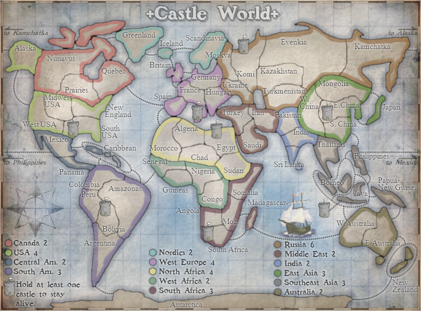
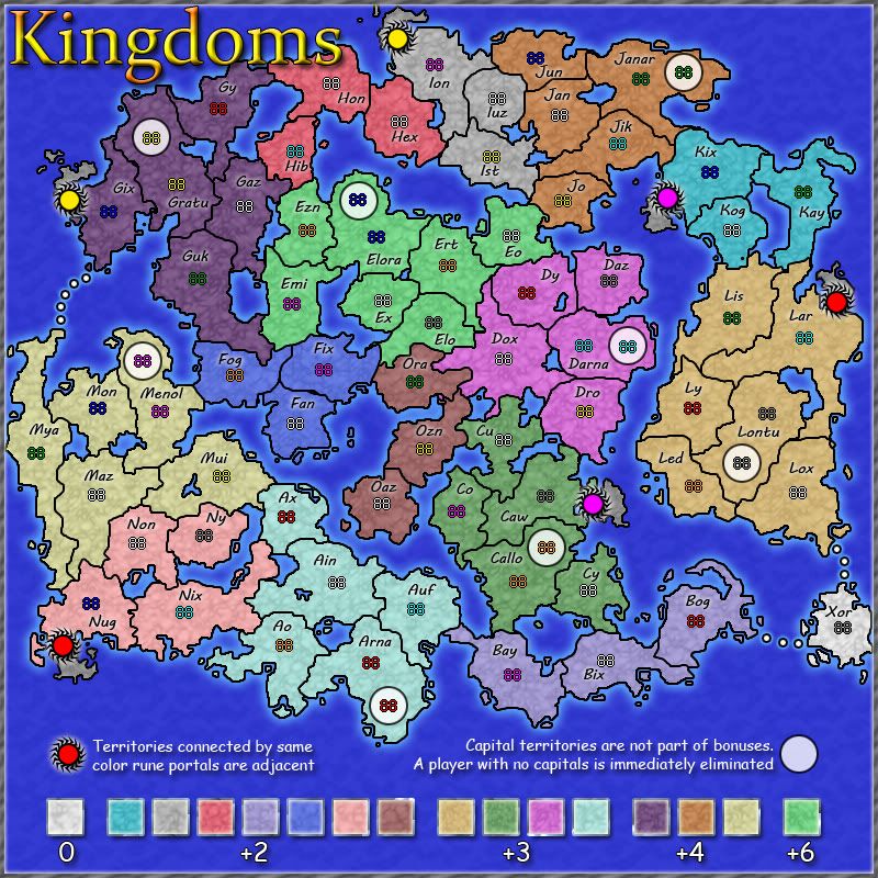
Ladies and gentlemen, the entries have all been entered, and us on the Cartography staff have made all the tough decisions, putting together a shortlist just three entries long from a wide open field of three entries. What's going to happen now is, the CC public is going to get a week for comments and suggestions to make these three maps even better than they are now. Mapmakers are still anonymous, but of course they'll be able to read all the comments and, if they see a good suggestion, tweak their map accordingly. This period will end next Friday, November 19, at which time the voting will start. I think we've got some pretty solid entries in this, so take a look:
Entry A: Castle World
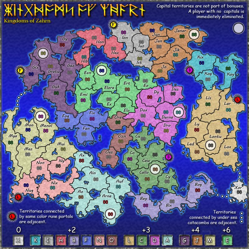
Entry B: Kingdroms
Entry C: Title TBD
Entry A: Castle World
- Click image to enlarge.
- Click image to enlarge.
- Click image to enlarge.

Re: A Capital Competition
Lol!Evil DIMwit wrote:putting together a shortlist just three entries long from a wide open field of three entries.
But after seeing the maps, I don't really regret not entering, since I doubt I'd come up with anything remotely close to as good as these.
With Entry A, idk if that was the intention, but it looks a bit too doodle earthy? I think it could maybe use some work with the borders etc
Entry B, I guess similar concerns with the borders, tho over here I think they look clunky/pixelated(?) so if there's some way to make it a bit smoother? (Maybe entries A and B could look at each others to improve both?)
Entry C looks to have a nice concept, I haven't really seen anything similar before, while A and B look similar to doodle and tamriel respectively for some reason
Spoiler

Re: A Capital Competition -- Comment Time
Wow, love Entry C. Just a couple of points.
I assume the cities are to be differentiated by the colors of the palaces but, since that might be a little ambiguous, there is a main square in each city, and the city names are all short, I would suggest renaming each "Main Square" by the city name. For example, "Tayt Square", "Aery Square", etc. That way, the cities would be easier to tell apart but you wouldn't have to find room somewhere else in the city to "label" it.
Also, in the legend, "The palace can be assaulted only through the main square of the city where the building" is not a complete sentence. In fact, I'm not sure you even need this instruction, since the only road to the palace is from the main square.
Oh, as for a title, how about something along the lines of "Middle Ages"? I actually don't think that's a very exciting title, but that's certainly the feeling that I get from this map.
-
TheSaxlad
- Posts: 1138
- Joined: Fri Jun 04, 2010 5:42 am
- Gender: Male
- Location: ShakeyCat's Saxland :)
Re: A Capital Competition -- Comment Time
I like entry A.
it has that south africa feel to it
it has that south africa feel to it


Re: A Capital Competition -- Comment Time
Some nice entries.=here. I was going to have a go, but only had time to put together a nice background (that I may or may not use on another map at some point).
Map A: I'd agree with the above comment that a slightly more accurate border to the land would make the map feel less doodle-earthy; it just needs roughening up a bit and not being quite so smooth
Map B: The bonuses are too difficult to work out from the colour-bar. Either similar values need to have similar colours, or you need to find a clearer way of matching the area to a square.
Map C: The title is obviously unfinished, and may benefit from a sky-ish feel to it? It would be nice to have each village/town named somehow.

PB: 2661 | He's blue... If he were green he would die | No mod would be stupid enough to do that
-
Victor Sullivan

- Posts: 6010
- Joined: Mon Feb 08, 2010 8:17 pm
- Gender: Male
- Location: Columbus, OH
- Contact:
Re: A Capital Competition -- Comment Time
My vote goes to A. I say let's stick to the basic world map for the first capitals map.
B I find extremely unappealing. It's just a generic land mass made-up that seems too symmetrical and man-made (unlike Thyseneal, which seems more legit). The names are also bad. Idk... It's hard top relate to and therefore play a map like this.
C is alright and fairly unique, but I'm not convinced the palaces are in evenly guarded spots. It overall is a bit overwhelming at first glance.
Like I said, I think we should stick with the basics for the first capitals map.
-Sully
Beckytheblondie: "Don't give us the dispatch, give us a mustache ride."
Scaling back on my CC involvement...
Scaling back on my CC involvement...
Re: A Capital Competition -- Comment Time
All the maps have identical gameplay :-/Victor Sullivan wrote: C is alright and fairly unique, but I'm not convinced the palaces are in evenly guarded spots.
PB: 2661 | He's blue... If he were green he would die | No mod would be stupid enough to do that
-
Victor Sullivan
- Posts: 6010
- Joined: Mon Feb 08, 2010 8:17 pm
- Gender: Male
- Location: Columbus, OH
- Contact:
Re: A Capital Competition -- Comment Time
(I'm posting the maps here so we don't have to keep flipping between pages)
Entry A: Castle World
For A (though I suppose it applies to all of them), I wanted to look at some of the bonuses:

There. My thoughts. In Excel form. Yay.
-Sully
Entry A: Castle World
- Click image to enlarge.
There. My thoughts. In Excel form. Yay.
-Sully
Last edited by Victor Sullivan on Sat Nov 13, 2010 1:49 pm, edited 1 time in total.
Beckytheblondie: "Don't give us the dispatch, give us a mustache ride."
Scaling back on my CC involvement...
Scaling back on my CC involvement...
-
Victor Sullivan
- Posts: 6010
- Joined: Mon Feb 08, 2010 8:17 pm
- Gender: Male
- Location: Columbus, OH
- Contact:
Re: A Capital Competition -- Comment Time
Okay, I see it now. Still like the basic World format best.MrBenn wrote:All the maps have identical gameplay :-/Victor Sullivan wrote: C is alright and fairly unique, but I'm not convinced the palaces are in evenly guarded spots.
Beckytheblondie: "Don't give us the dispatch, give us a mustache ride."
Scaling back on my CC involvement...
Scaling back on my CC involvement...
Re: A Capital Competition -- Comment Time
I would really love seeing C in play.
Reminds me of all those wasted years.
Reminds me of all those wasted years.
-
dolomite13

- Posts: 1379
- Joined: Mon Aug 18, 2008 5:54 pm
Re: A Capital Competition -- Comment Time
I have to say I love all three... any chance all three could be advanced to the foundry after a winner is declared. While the gameplay is the same a few tweaks to any of the three could make them completely play completely differently. Regardless of who wins I hope that the all of the map creators submit their maps though the standard process.
A) a classic style map that stuck to the sample really well. The small castles almost seem out of place and will take some work to fit units on them.
B) I like the way the creator of this map moved the western continents (americas) to the east side of the map and skewed it while keeping the connections in tact. I would like to see the map toned down a bit color wise. I like how all the territories in a continent start with the same letter.
C) Love the concept but the graphics look like they come out of some sort of fantasy mapping software program.
As for the bonuses I think Sully is right and I noticed that the west africa area on the sample map doesn't have a territory marked to start neutral like all other territories. To make it so there can be no bonus drop at all one of those should start neutral.
=D=
Where Have I Been? ... Testing a prototype board game that I co-designed called Alien Overrun!
-
Evil DIMwit
- Posts: 1616
- Joined: Thu Mar 22, 2007 1:47 pm
- Gender: Male
- Location: Philadelphia, NJ
Re: A Capital Competition -- Comment Time
Entry A: It's not clear that castles only connect to the territory they're in. Also, the legend looks rather crowded on the right side. Maybe you should move the Madagascar-Australia connection up some, and the ship can be smaller or go somewhere else.
Entry C: Should Tower F be connected to Tower E? Also, I agree that each city should have its name on the map, not just in the legend, so people don't have to keep looking back and forth. Particularly colorblind people.
Perhaps put the continents' initial letters on the bonus value diagram for easy identification. Then you don't even have to worry about colorblindness.MrBenn wrote: Map B: The bonuses are too difficult to work out from the colour-bar. Either similar values need to have similar colours, or you need to find a clearer way of matching the area to a square.
Entry C: Should Tower F be connected to Tower E? Also, I agree that each city should have its name on the map, not just in the legend, so people don't have to keep looking back and forth. Particularly colorblind people.
I think that messes up the starting territory counts, though. In any case it's only a bonus of 2 and it's not too easy to hold, as it is, which I think is fine given how it fits with the rest of the map.dolomite13 wrote: As for the bonuses I think Sully is right and I noticed that the west africa area on the sample map doesn't have a territory marked to start neutral like all other territories. To make it so there can be no bonus drop at all one of those should start neutral.
-
fumandomuerte

- Posts: 620
- Joined: Sat Dec 29, 2007 1:27 am
- Gender: Male
- Location: The Cinderella of the Pacific
Re: A Capital Competition -- Comment Time
I like option C but it doesn't make sense that markets on the other side of the map attack each other. Why not catapults, alchemists or evil witches instead?


Re: A Capital Competition -- Comment Time
Three very interesting entries to the competition, each bringing a novel touch.
Entry A has made a very likable version of the example map.
Entry B has twisted and stretched the world in very interesting ways. However, it has added a territory to what the example depicts as South America.
Entry C has some interesting graphics, but as has been noted already, has ambiguous labels. (Because of this, I cannot easily check if the gameplay has stayed true to the original specifications.)

Re: A Capital Competition -- Comment Time
I would like option C to be pursued. But as mentioned, it looks like it was created from a pro-fantasy type app. Sorry to the maker if it wasn't.

-
Evil DIMwit
- Posts: 1616
- Joined: Thu Mar 22, 2007 1:47 pm
- Gender: Male
- Location: Philadelphia, NJ
Re: A Capital Competition -- Comment Time
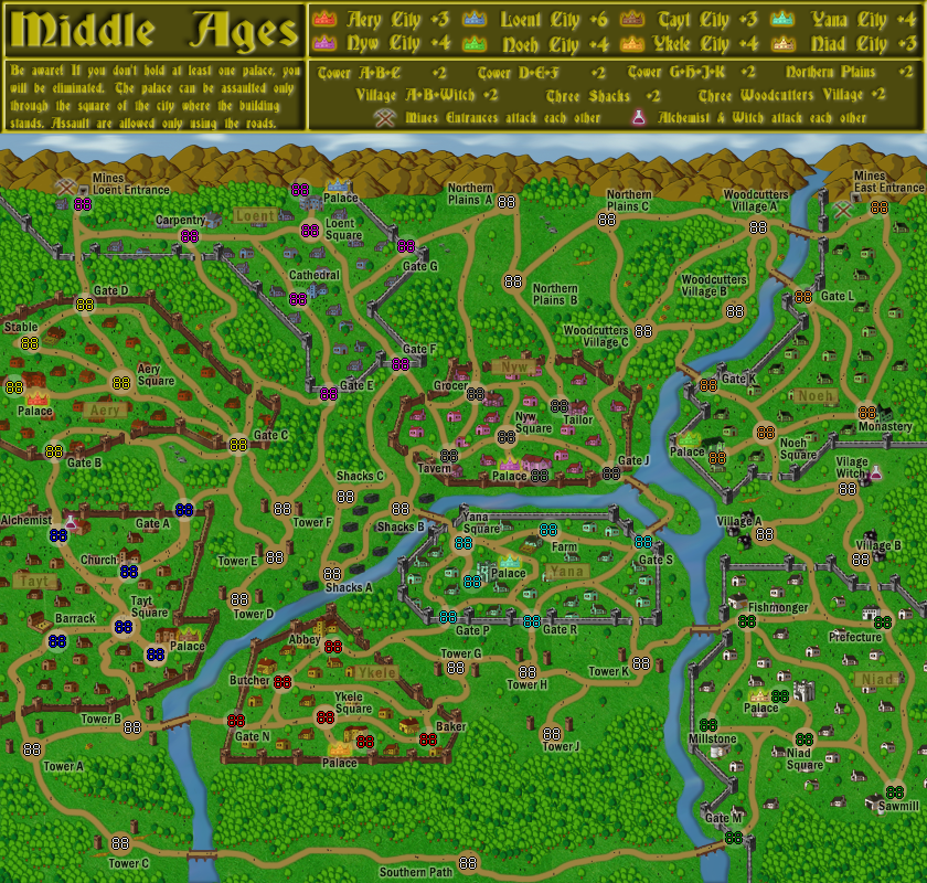
We have an update from Entrant C:
Entrant C would also like to ask: Are the bonuses easier to understand with different colors for houses? Does the community like the colored houses? Is the text in the legend readable?Entrant C wrote:Donethere is a main square in each city, and the city names are all short, I would suggest renaming each "Main Square" by the city name. For example, "Tayt Square", "Aery Square", etc. That way, the cities would be easier to tell apart but you wouldn't have to find room somewhere else in the city to "label" it
Fixedin the legend, "The palace can be assaulted only through the main square of the city where the building" is not a complete sentence
Okfor a title, how about something along the lines of "Middle Ages"?
sky and labels addedmay benefit from a sky-ish feel to it? It would be nice to have each village/town named somehow.
FixedShould Tower F be connected to Tower E? Also, I agree that each city should have its name on the map, not just in the legend, so people don't have to keep looking back and forth. Particularly colorblind people.
Fixedit doesn't make sense that markets on the other side of the map attack each other. Why not catapults, alchemists or evil witches instead?
but the graphics look like they come out of some sort of fantasy mapping software program.it looks like it was created from a pro-fantasy type appEverything is freehand drawn. I also have sketches if there are any doubts.
- Click image to enlarge.
Re: A Capital Competition -- Comment Time
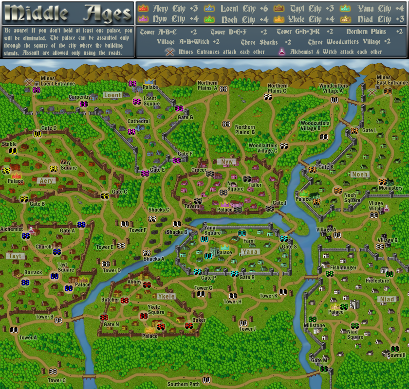
Wow, this is the first time I've commented on a map in development and all of my suggestions were implemented. I'll try not to let the power go to my head.Evil DIMwit wrote:Entrant C would also like to ask: Are the bonuses easier to understand with different colors for houses? Does the community like the colored houses? Is the text in the legend readable?
I don't know if the colored houses are all that helpful, but they certainly don't hurt. I rather like them. I find the legend text to be readable.
Re: A Capital Competition -- Comment Time
The colour on the houses is barely noticeable, and will be less so on a smaller version of the map (this is the large, isn't it?). Applying the colour to the names of the cities might be more helpful. By the way, I find the city names a bit faint. The text in the legend is a bit furrier than I like, and likely won't get more legible when made smaller.Evil DIMwit wrote:Entrant C would also like to ask: Are the bonuses easier to understand with different colors for houses? Does the community like the colored houses? Is the text in the legend readable?
-
fumandomuerte
- Posts: 620
- Joined: Sat Dec 29, 2007 1:27 am
- Gender: Male
- Location: The Cinderella of the Pacific
Re: A Capital Competition -- Comment Time
In my opinion it is very clear that cities comprise all the territories within walls.
Re: A Capital Competition -- Comment Time
what about slightly different shades of grass within the walls - meaning a different shade for each village.

Re: A Capital Competition -- Comment Time
I would really like to see map A become playable first, although I like all three ideas.
-
Evil DIMwit
- Posts: 1616
- Joined: Thu Mar 22, 2007 1:47 pm
- Gender: Male
- Location: Philadelphia, NJ
Re: A Capital Competition -- Comment Time
Another update from Entrant C, probably the last one before voting starts:
- Click image to enlarge.
-
Evil DIMwit
- Posts: 1616
- Joined: Thu Mar 22, 2007 1:47 pm
- Gender: Male
- Location: Philadelphia, NJ
-
Evil DIMwit
- Posts: 1616
- Joined: Thu Mar 22, 2007 1:47 pm
- Gender: Male
- Location: Philadelphia, NJ