
^^ koontz, refresh v24 above please.
Is that better?
CLASSIC CITIES: Moscow [Quenched]
Moderator: Cartographers
Forum rules
Please read the Community Guidelines before posting.
Please read the Community Guidelines before posting.
Re: CLASSIC CITIES: Moscow [15.12.12] V24-P15 GFX Stamp??

* Pearl Harbour * Waterloo * Forbidden City * Jamaica * Pot Mosbi
-
koontz1973

- Posts: 6960
- Joined: Thu Jan 01, 2009 10:57 am
Re: Re: CLASSIC CITIES: Moscow [15.12.12] V24-P15 GFX Stamp?
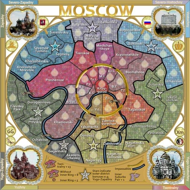
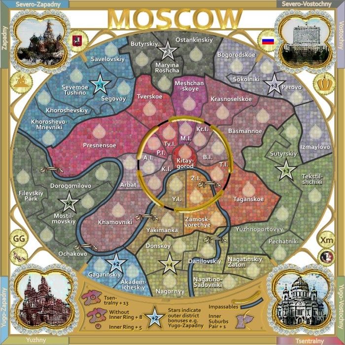
Yes, for me much better. Do not forget to remove the black lines running down the sides of the gold clips though. Pechatniki and Gagarinskiy.

Re: Re: CLASSIC CITIES: Moscow [15.12.12] V24-P15 GFX Stamp?
thank-you, let's see if that satisfies y2manypbr and isaiah40koontz1973 wrote:Yes, for me much better. Do not forget to remove the black lines running down the sides of the gold clips though. Pechatniki and Gagarinskiy.
* Pearl Harbour * Waterloo * Forbidden City * Jamaica * Pot Mosbi
Re: CLASSIC CITIES: Moscow [15.12.12] V24-P14 GFX Stamp??
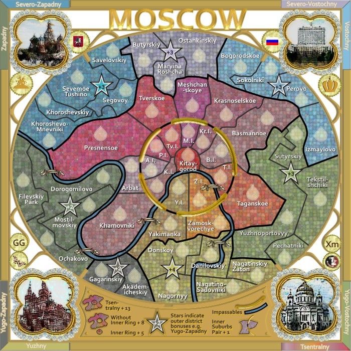
Version 24.
* Pearl Harbour * Waterloo * Forbidden City * Jamaica * Pot Mosbi
-
koontz1973
- Posts: 6960
- Joined: Thu Jan 01, 2009 10:57 am
Re: Re: CLASSIC CITIES: Moscow [15.12.12] V24-P15 GFX Stamp?
Someone forgot.koontz1973 wrote:Do not forget to remove the black lines running down the sides of the gold clips though. Pechatniki and Gagarinskiy.
Re: Re: CLASSIC CITIES: Moscow [15.12.12] V24-P15 GFX Stamp?
no didn't forget, but was asleep, and i think it looks better like this...at least we can see the whole region borderkoontz1973 wrote:Someone forgot.koontz1973 wrote:Do not forget to remove the black lines running down the sides of the gold clips though. Pechatniki and Gagarinskiy.
* Pearl Harbour * Waterloo * Forbidden City * Jamaica * Pot Mosbi
-
Funkyterrance

- Posts: 2494
- Joined: Wed Jan 19, 2011 10:52 pm
- Gender: Male
- Location: New Hampshire, USA
Re: Re: CLASSIC CITIES: Moscow [15.12.12] V24-P15 GFX Stamp?
Well, tbh this map is challenging for me to read but not impossible. The colorblindness thing certainly does slow down my comprehension of the map but it appears that the colors are just contrasting enough so that I can make them out if I focus and shift my eyes back and forth enough from one to the other. It's a very pretty map though and I think that in order for you to make it readable enough for me to use it easily you would lose a lot of this prettiness.
For the record though I'll not the spots that look very close at a glance, enough for me to have to slow down and focus back and forth:
Severo-Zapadny/Vostochny
Yuzhny/Yugo-Vostochny
As I said though, I can make them out if I try, it just takes a little more effort. I'll use waterloo again as a reference as this map is much easier to read than that one. Tbh, I could work with this. I do think it's a beautiful map and it definitely captures that Old Russian feel. .
Last edited by Funkyterrance on Sat Dec 15, 2012 4:24 pm, edited 1 time in total.

Re: Re: CLASSIC CITIES: Moscow [15.12.12] V24-P15 GFX Stamp?
OK, thanks FT.Funkyterrance wrote:Well, tbh this map is challenging for me to read but not impossible. The colorblindness thing certainly does slow down my comprehension of the map but it appears that the colors are just contrasting enough so that I can make them out if I focus and shift my eyes back and forth enough from one to the other. It's a very pretty map though and I think that in order for you to make it readable enough for me to use it easily you would lose a lot of this prettiness.
For the record though I'll not the spots that look very close at a glance, enough for me to have to slow down and focus back and forth:
Severo-Zapadny/Vostochny
Yuzhny/Yugo-Vostochny
As I said though, I can make them out if I try, it just takes a little more effort. I'll use waterloo again as a reference as this map is much easier to read than that one. Tbh, I could work with this. I do think it's a beautiful map and it definitely captures that Old Russian feel. The part I am still fuzzy on however, is the region in the middle of the map... Those I have no idea what goes with what but I assumed they were not part of the bonuses. If they are, I may have a problem with this map after all as far as colorblindness is concerned.
If i'll see what i can do with the colours of those regions you mentioned...i don't think it will lose it's charm
* Pearl Harbour * Waterloo * Forbidden City * Jamaica * Pot Mosbi
-
Funkyterrance
- Posts: 2494
- Joined: Wed Jan 19, 2011 10:52 pm
- Gender: Male
- Location: New Hampshire, USA
Re: Re: CLASSIC CITIES: Moscow [15.12.12] V24-P15 GFX Stamp?
Edited my last post, the inner bonus is obvious now that I looked at the legend. 

Re: CLASSIC CITIES: Moscow [15.12.12] V24-P15 GFX Stamp??
Darker borders help see the bonus! Thanks
Re: CLASSIC CITIES: Moscow [16.12.12] V25-P15 GFX Stamp??
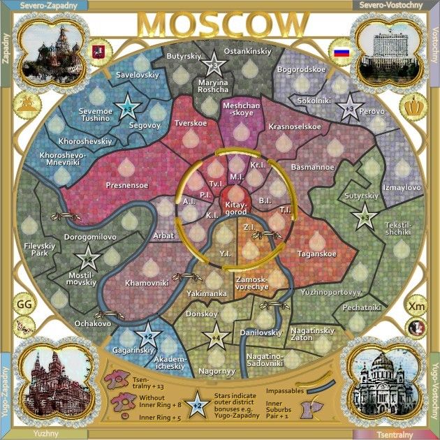
Thanks y2manypbr....this is a swapped colur version i dod to help FT.y2manypbr wrote:Darker borders help see the bonus! Thanks
Does this work better for you also.
* Pearl Harbour * Waterloo * Forbidden City * Jamaica * Pot Mosbi


Re: CLASSIC CITIES: Moscow [17.12.12] V25-P15 888s
* Pearl Harbour * Waterloo * Forbidden City * Jamaica * Pot Mosbi

Re: CLASSIC CITIES: Moscow [17.12.12] V25-P16 888s
the black border instead yellow is more clear. maybe a less opacity (also for border around river) could helps. the impassable gold circle has one (two?) parts another as the rest ones...
nice map.
Oneyed
nice map.
Oneyed
Re: CLASSIC CITIES: Moscow [17.12.12] V25-P16 888s
GoodOneyed wrote:the black border instead yellow is more clear.
consider donemaybe a less opacity (also for border around river) could helps.
the impassable gold circles is representational and meant to show that the section is impassable...of course on the map there are 5 sections. It is fine.the impassable gold circle has one (two?) parts another as the rest ones...
thank-younice map.
Oneyed
* Pearl Harbour * Waterloo * Forbidden City * Jamaica * Pot Mosbi
Re: CLASSIC CITIES: Moscow [17.12.12] V25-P16 888s
sorry but part of golden circle in Presnensoe looks as old one which you had. it realy does not have golden metalic look as the rest ones.cairnswk wrote:Oneyed wrote:the impassable gold circles is representational and meant to show that the section is impassable...of course on the map there are 5 sections. It is fine.the impassable gold circle has one (two?) parts another as the rest ones...
Oneyed
Re: CLASSIC CITIES: Moscow [17.12.12] V25-P16 888s
and you'll have to take my word for it, that it is as new as the rest regardless of its looksOneyed wrote:...
sorry but part of golden circle in Presnensoe looks as old one which you had. it realy does not have golden metalic look as the rest ones.
Oneyed
* Pearl Harbour * Waterloo * Forbidden City * Jamaica * Pot Mosbi
Re: CLASSIC CITIES: Moscow [17.12.12] V25-P16 888s
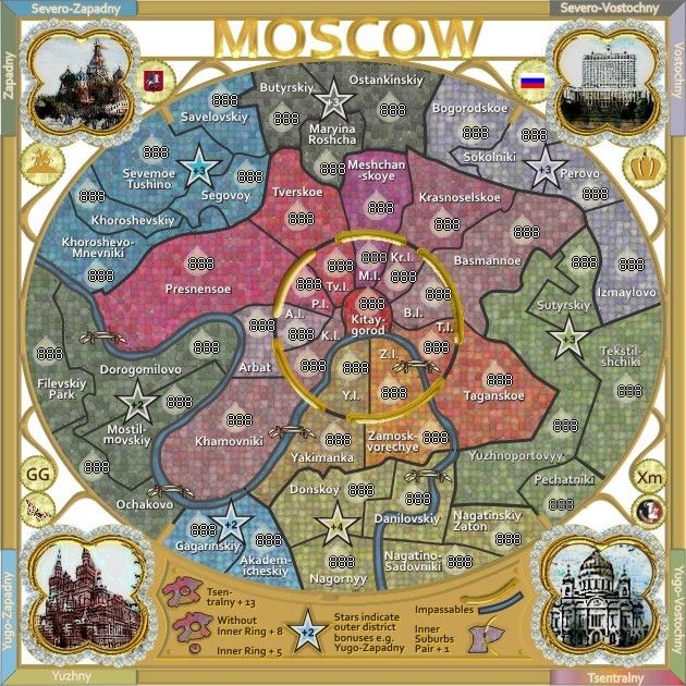
Small
Large
with 888s.
Large
with 888s.
* Pearl Harbour * Waterloo * Forbidden City * Jamaica * Pot Mosbi
Re: CLASSIC CITIES: Moscow [17.12.12] V25-P16 888s
Can you place the 888's in the stars as well cairns? I think the the 888's will overlap a couple of the region names in a couple of places, especially on the small.
Re: CLASSIC CITIES: Moscow [17.12.12] V25-P16 888s
no, isaiah40, i cannot place the 888s in the stars, because the stars are not territories, and 888s should not be in the stars.isaiah40 wrote:Can you place the 888's in the stars as well cairns? I think the the 888's will overlap a couple of the region names in a couple of places, especially on the small.
the 888s are on the small map. did you have too much xmas cheers this morning? or simply wake up on the wrong side of the bed?
or simply fail to read the legend about the stars?
* Pearl Harbour * Waterloo * Forbidden City * Jamaica * Pot Mosbi
Re: CLASSIC CITIES: Moscow [17.12.12] V25-P16 888s
cairnswk wrote:no, isaiah40, i cannot place the 888s in the stars, because the stars are not territories, and 888s should not be in the stars.isaiah40 wrote:Can you place the 888's in the stars as well cairns? I think the the 888's will overlap a couple of the region names in a couple of places, especially on the small.
the 888s are on the small map. did you have too much xmas cheers this morning? or simply wake up on the wrong side of the bed?
or simply fail to read the legend about the stars?
Re: CLASSIC CITIES: Moscow [17.12.12] V25-P16 888s
NPs.isaiah40 wrote:...
Yep too much Christmas cheer already! That and misread it!
* Pearl Harbour * Waterloo * Forbidden City * Jamaica * Pot Mosbi
Re: CLASSIC CITIES: Moscow [17.12.12] V25-P16 888s
The impassable ring is very pixelly, especially on the top portion of it. Also the bottom right inset doesn't look as good as the other 3 insets. I see a lot of black pixels on the building. Can you try and clean it up a bit??
Re: CLASSIC CITIES: Moscow [17.12.12] V25-P16 888s
NO, this is the way that is comes out of the CorelDraw functions.isaiah40 wrote:The impassable ring is very pixelly, especially on the top portion of it. Also the bottom right inset doesn't look as good as the other 3 insets. I see a lot of black pixels on the building. Can you try and clean it up a bit??
I have masked the gold rings sections when doing the gold process so that it wouldn't pixelate too much, however it still occurs.
On the corner images, these are 4 different images that have differing elements, i have tried to apply the same watercolour process to them so they turned out much the same.
I see a lot of black in all images...and am happy with them.
* Pearl Harbour * Waterloo * Forbidden City * Jamaica * Pot Mosbi
Re: CLASSIC CITIES: Moscow [17.12.12] V25-P16 888s
Well cairns, the only two I have a problem with is the top and bottom ones, the others look good.